In this exercise you can use any images created elsewhere in the course, to print onto the paper samples you collected earlier.
Active experimentation
You are encouraged to be experimental in these exercises; it doesn’t matter if you make a mess or get things wrong in the images you make. It is important to reinforce this message at this point in the creative process, as often people tighten up when they think they are embarking on the final piece, and lose some of the fluidity and spontaneity of their original ideas. We want to keep the visual outcome of this exercise fresh and not stultified by perceived conventions of what is ‘right’.
When you’re exploring visual ideas and processes, the outcomes may not always be what you thought they would be at the outset. You won’t always get it right the first time, and this is how it should be. By repeatedly trying out and experimenting with the materials and ideas at hand, you’ll discover new ways of working. Occasionally ‘mistakes’ turn into happy accidents and prompt a way of working, or technique, that you might choose to deliberately recreate and integrate into your next project. For example, one colour may bleed into another, or your coffee cup might leave a stain on your working paper. Instead of throwing these elements away, you could integrate them into your design process.
Organising images
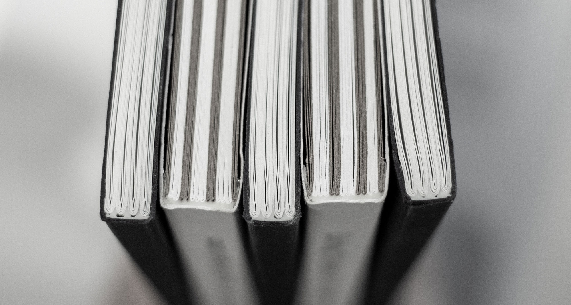
When you’ve created a set of images, scan or photograph these to create digital files – JPEGS or TIFFs on your computer. Make sure the resolution is set at 300dpi. Having gathered all the images together in one folder, consider how you’re going to print them. What order will the images appear in? At what size? How will the image appear on the page? Which paper will you use for which image? Do you have a particular image in mind for a particular piece of paper? Will you try printing the same image on different sheets of paper?
Draw a simple flatplan as a guide to working out how and where the image will be placed on the page, whether you will include any text, and to explore how the idea of ‘narrative’ might work. You might set up your page layout in DTP software, and work with your images digitally in this way, or you may simply print direct from your photo editing software onto the paper samples.
Printing
You may choose to use a desktop printer to output your images, or you may research other print methods such as screen-printing or etching. Print at least 16 pages using the images you’ve created on the paper samples you have collected.
Design process
For this exercise, I thought I can use the images that I made so for in my course. I chose 16 images and 8 different papers, some from G.F SMITH and the rest from the papers that I had at home. As some papers are coloured, I decided to make them all B & W to be able to compare them based on the type of the papers.
For the layout, I made it landscape but then change the layout as I thought it would work better with my printer.
First flat plan

Second flat plan

Working on Indesign
I made a document with 8 pages in Indesign and put 2 images in one page. Then make them all B & W.

JPEG images


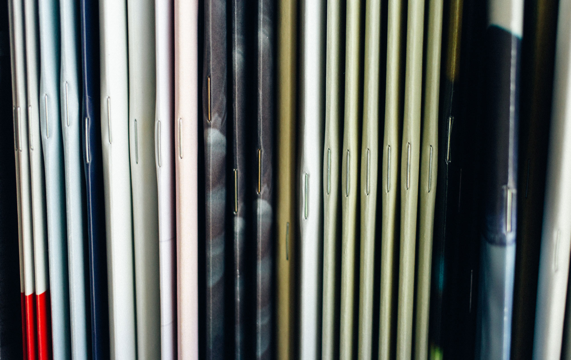
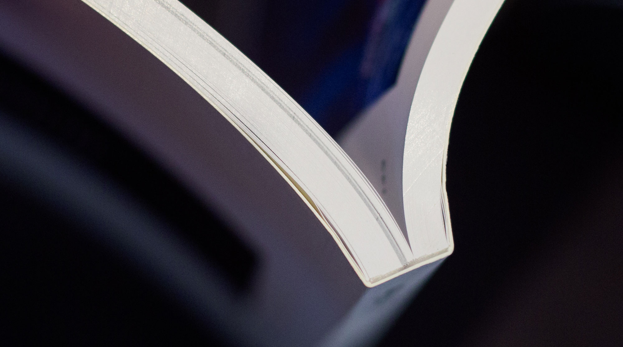
Results
G.F SMITH – Cranes Crest, fluorescent white
This paper is very similar to the normal A4 copy paper with a bit more texture and a bit heavier. It came out of the printer easily. Considering the type of the printer, which is a very basic home printer the images are quite sharp.
G.F SMITH – Sketch natural, ivory
This paper has a hairy like texture and it’s 120 GSM. Came out of the printer easily. It’s smoother than the previous paper so the images are sharper.
G.F SMITH – Neenah Environment, desert storm
This paper is a recycled paper, it’s 90 GMS and got some texture but has got a smooth surface. I personally like the colour and it’s earthy feeling. It might not be a good choice for an elegant result but it is an environmental friendly.
G.F SMITH – Colorplan, rust
This paper is 135 GSM and has a Fabric finish. I really like the texture and colour. It’s very vibrant and the texture is very interesting. I think It’s a good choice for some modern brochures.
G.F SMITH – Wild, Clay
This paper is quite thick, 150GSM and I was worried that my printer couldn’t handle it. However, it came out fine. The texture is quite strong so the images are not very sharp.
Cartridges paper
This paper is whiter and much heavier that normal A4 copy paper. It is very smooth so the images are quite sharp.
Sugar paper, yellow
This paper is very light with lots of texture. It’s a recycled paper so it’s got a rough surface and not very strong for hard use. The quality of the images are very low.
Sugar paper, pink
This paper is the as the previous one but different colour. It’s nice to see that just by changing the colour how the effect will change. Although it is a recycled paper, it’s not very practical for everyday use.
Self – reflection
That was an interesting exercise to see how the effect and quality of the print with the same default would change with different kind of papers. The printer that I used was a very basic home printer, I assuming that the result would depend on the printing process. Obviously, there are a massive range of papers available with different finishes so the end results would be very interesting