In collaboration with Tate Modern and curator Simon Baker, Offprint London dedicates a special space for photobooks, inviting independent photobook publishers from all over the world.
Along with photography, books on contemporary art, graphic design, literature, poetry, philosophy, and experimental music were on sale.
Across the weekend, a series of workshops and performances were organised by Bruno Ceschel, founder of Self Publish, Be Happy.
The fair was designed to “showcase an alliance between printed strategies and digital cultures within the art world, presenting concrete examples of the contemporary dissemination of artistic practices.”
London Art Book Fair
For four exciting days, creative and cutting-edge publishers, big and small, transform the Whitechapel Gallery into the London Art Book Fair. Discover a vibrant mix of art books and magazines from around the world.
Convened by associate curator Amy Budd this year’s public programme for the London Art Book Fair brings together some of the most innovative art publishers into dialogue around key questions in the industry today, alongside presentations by London-based artists, curators and poets working with text, publishing and performance.
Small Publishers Fair
The Small Publishers Fair brings to Conway Hall sixty five publishers from across the UK and further afield. It is a snapshot of some of best small press publishing around today and includes artists’ books, fine press editions, poetry pamphlets and zines.
Visitors to this free event come to browse and chat with publishers. Most of the books are limited editions and hard to find. Prices range from £1 to £200.
The Fair and the publishers themselves are proud that the event takes place in Conway Hall, the great centre of humanism and literary Bloomsbury.
In addition to the book fair there’s a special exhibition about London publisher Test Centre (2011-2018), and there are readings, talks and book launches.
International Artists’ Book Fair
The International Contemporary Artrists’ Book Fair held in Leeds is the longest running artists’ book fair outside of London. It celebrated its 20th anniversary in March 2017. Throughout its history the Fair has attracted national and international participants and welcomed thousands of visitors from across the UK. Since 2014 it has been held at The Tetley and co-curated with PAGES, the organisation run by AWP co-founder Dr Chris Taylor.
The Sheffield International Artists’ Book Prize
The Prize was established in 2008 – with the aim to develop the profile of artists’ books and increase their audience – and attracted over fifty entries in its inaugural year. Since then the project has grown to become a biennial exhibition with an international reach, in 2011 attracting 180 entries from 22 countries. Having secured funding from Arts Council England and sponsorship from Open College of the Arts, the organisers hope the 2013 edition will be their biggest yet.
Dublin Art Book Fair
Dublin Art Book Fair champions artists and creative, small and independent publishers, Irish and international, with books on art, design, visual culture, philosophy, architecture, select fiction and poetry. With an unprecedented quality of submissions for the Artist Book Section received this year, you can look forward to a particularly strong representation of books made by artists.
BABE Bristol Artists’ Book Event
The first Bristol Artist’s Book Event (BABE) was organised by Sarah Bodman and Tom Sowden in collaboration with Peter Begen and Snoozie Claiden at Arnolfini in 2007. It has since grown into an international event showcasing artists’ books to the public over a Spring weekend every two years. Since its first outing, BABE has established a great reputation as a relaxed and friendly event to meet and talk to book artists about their work and buy works of art.
“All books are visual. Even books which rely exclusively on type, or on unusual materials, or chose which contain only blank sheets have a visual presence and character. All books are tactile and spatial as well – their physicality is fundamental to their meaning.” Johanna Drucker, The Century of Artists’ Books, 2004. Granary Books Inc. Page 197. Using a found book, significantly alter the appearance of the pages to create a new volume that is personal to you. This can be any kind of book that is of interest to you. For example, a fiction book, a non-fiction book, a picture book or a photo book. Approach the found book in a very physical way, manipulating the pages and paper inventively. If you need to, stitch or glue a number of pages together to reduce the ground you need to cover. Decide what to remove from the book, and what to add. Use the found book as a source of ideas and inspiration – the existing text may inspire illustrative, conceptual images, collages or typography as image. Embed, overlay and integrate your work into the existing pages using whatever materials, media and processes you feel necessary. This may be digital, hand-rendered, photographic, textile, or a combination of all these and more. Think about the relationship between the content and the form, the design (text and images), the materials you use, such as papers. Perhaps you are creating a new sequence within the book? Change the book from its original form into a different form, altering the appearance and/or meaning. Apply an inventive, intuitive response to materials and how these can be exploited within the context of the altered book. Refer to your contextual research into artists and designers in the unit so far. Use elements of your research as inspiration and to inform your book-altering practice.
Reflection Write a paragraph reflecting on the assignment and reflect on your process and decision making. Are you looking in a different way to meaning, materials, design and the form of the book?
Analysing the brief:
What is the briefasking? Altered book
Who is the target audience? Anybody who is interested in altered books.
Whatthings need to be included? Manipulating the pages and paper inventively.
Howwill it be produced? Change the book from its original form into a different form, altering the appearance and/or meaning. Apply an inventive, intuitive response to materials and how these can be exploited within the context of the altered book.
Keywords:
Altered book
New volume
Personal
Any book
Manipulating pages
Various materials
Primary research:
What Is An Altered Book?
An altered book is an art object that has been created from an existing, printed book. The book is altered through whatever means and media the artist chooses. This generally means using the book’s pages as a canvas on which to apply paint, collage or rubber stamping. It could also mean cutting into the book to create a more sculptural piece.
Approaches to book altering are as varied as the artists who undertake them. A textile artist or quilter might choose to use fabric to alter their books. A rubber stamper might opt to stamp and use inks and sprays. A painter could use a book as a canvas for several works in acrylic, watercolour r, or oils. Each artist brings their own skills acquired in other creative pursuits, and applies them to the same general surface: a printed book.
Some altered book artists choose to work within a certain theme throughout the pages of a book, while others see each page as a work that stands on its own. Some artists choose to work collaboratively, in exchanges or round robins, where books are passed around a group of artists, each adding her own work to whichever book she has at the moment.
But I Would Never Deface a Book!
Many altered book artists have experienced the hand-wringing and wailing that comes from people who believe that books are sacred objects, and should never be defaced. If you’re one of those people, let me put your mind at ease:
Most altered book artists work in old books. Not museum-quality old. Back of the used book store, marked down to nothing, nobody has any use for them any more old. We work in books that, if not purchased for art, will be shredded for pulp.
Many artists check the books they buy against vintage book listings, to ensure they are not about to cut into a book that still has value. In general, if you bought a book for a dollar, Googled it when you got home, and discovered a copy of it was causing a bidding war on eBay, you probably wouldn’t cut into it. Neither would I, nor would any other reasonable person.
Some artists have a personal list of books they absolutely would not use for altering, no matter how old or inexpensive it might be. Some (but not all) would pass on working in a Bible, Quran, or other holy books. Some might prefer not to work in a book of another artist’s images, as in a tabletop art book.
Altered book artists respect books in a way that is second only to librarians. Never fear: we are not defacing books that anyone wants or needs. We are resurrecting old, unloved books, and turning them into art!
How To Choose a Book For Altering
If you’re looking for a book to alter page by page, you’ll want to consider a few things. You should probably choose a book that’s constructed with a sewn spine, filled with soft paper, in a size you can live with.
Things to look for:
Size. I like to work big, so I hunt for large books. You might like to work smaller. This is a personal preference, and one that you will develop as you work. If you’re choosing your first book, don’t feel you have to know what the perfect size for you might be. you’ll learn that as you go.
Paper quality. I like pages that feel like they have a lot of cotton in them: soft to the touche, and sturdy. That usually means choosing an older book. Avoid books with glossy pages.
A sewn spine. Check the headband to be sure it’s soft and loose, with scalloped ridges where groups of pages (signatures) are attached. Look for the beginning of a signature, and check it at the spine for stitching.
Books to avoid:
Paperbacks. In general, paperback books aren’t sturdy enough to withstand altering.
Glued bindings. Pages that are glued into the spine rather than stitched will pull out easily.
Preparing Books To Alter
If you’re going to alter a book in a way that adds even a little bulk, you may want to prepare it first, by removing some pages.
Now What?
Once you have your book prepared for altering, use whatever creative skills you have to fill it! The one and only rule about altering a book is that their are no rules. Whatever you feel like doing to your book is fine. Draw in it. Doodle in it. Paint in it. Light it on fire and throw it in the bath tub. (I really did this. Twice. Both times, for books concerning fire.)
Mind mapping
Mood board
I’ve collected some examples of Altered Books from Pinterest.
My book
The book that I have chosen for this assignment is “I’ll be there” by Holly Goldberg Sloan. This is a romance book. I decided to add lots of hearts, butterflies and flowers to my design to match the genre.
Design process
I started by cutting some elements from the cover and engraved some heart shaped from the inside the book.
Then I made some heart and butterflies with some pages of the book.
I cut some flowers from the wallpaper sample, which I had. I added more butterflies and 3D heart.
I used watercolour and coloured pens to add some colour to my design.
I covered the back of the book with some wall paper.
Self-reflection
At first, I was a bit confused because I wasn’t sure which book I should choose. However, after deciding about the book, I really enjoyed working on this assignment. I really like art and craft specially making things with paper. I probably could add more elements. I wasn’t quite sure where should I stop not to overdo my work, I thought it might get very tacky if I add loads of elements to it. Overall, this assignment shows my interest to flowers and paper crafts.
I’ve learnt a lot about book design and the process of making a book both as a normal book and a decorative book. I hope I will be able to use my knowledge in the future.
Reflect, evaluate and rework Having printed your images from the previous exercise, take the opportunity to view all of the pages, reflect on them and evaluate before moving on to the next step of collating and binding the pages together. Which pages are successful? Which pages have not turned out as well as you had hoped? Are there any visual surprises, or happy accidents? Given the experimental and open-ended nature of this exercise, the answers may be quite subjective, but it is important you reflect on these and other questions, to sharpen your self-critical awareness and assessment of your own progress. You may want to re-work some of the images, and the printing process, and this is your opportunity to do that. You may end up with more and more pieces of printed paper. Select and collate Evaluate the strengths and weaknesses in your work and then begin a process of selecting up to 16 pages that work well together as a whole. Do these pages have images on each side of the page, or will the images appear on facing pages only? If you want to create back-to-back images you can work manually to cut and paste images and pages, using spray mount or similar. Equally, you can collage elements of printed ephemera onto and into the pages. Again, the brief is to be experimental, so work inventively with the process, cutting, gluing, pasting and arranging as you see fit. Collate these pages, putting them into a running order from beginning to end. Binding Drawing on your understanding of bookbinding so far, bind your 16 pages into a small book format. How will the pages be held together? Consider how the pages might be bound and experiment with solutions. Will you create a cover? Will the pages be stitched, sewn, glued, stapled or will you use another inventive approach? There are many ways to bind a book, either by hand or by machine. A few examples of bookbinding are saddle stitch, Japanese binding, coptic binding or perfect binding. Consider which binding is most appropriate for your book. There are some good tutorials online of bookbinding and this might be useful for you to have a look at. Try to use one of the bookbinding techniques mentioned above for your own book.
Document the whole process, photograph the book and incorporate them into your learning log, accompanied by supporting work, including pages and images you chose not to include into the final book form.
Reflect, evaluate and rework
Overall, I was happy with my final designs. I spent quite a lot of time on my previous exercise. I think, there are some of them that look stronger than others.
This design is one of my favourites, as it shows movement and it’s energetic. In this collage, I’ve used 3 photos with some geometric shapes and a textured layer on top. I wrapped the text to match the perspective to emphasise on destiny as a vanishing point.
This design is my least favourite one. Although, I think it conveys the message of this part of the poem, I personally think that the images are not very connected.
Binding
Different binding techniques:
1. Saddle stitch binding
When there’s brevity to be bound, there’s saddle-stitching to be found. Better suited to smaller documents, saddle-stitching is one of the simplest ways to secure printed sheets of paper folded in half. Consider it a professional iteration of stapling that appeals to any cost-effective booklet, brochure, catalogue, program or magazine.
2. PUR binding
What gives a paperback its clean PUR-fect edges? A process called PUR. You may have heard the term ‘perfect binding’ and wondered what the difference is. Both use a paperboard or heavy cover stock to attach pages to the spine with glue. But while the two applications are similar in concept, a PUR-bound document uses a special kind of adhesive known as polyurethane reactive (hence where it gets its name from).
If you’re looking to print a paperback, annual report or premium project, PUR makes for a strong, clean spine that’s durable enough to hold heavier stocks.
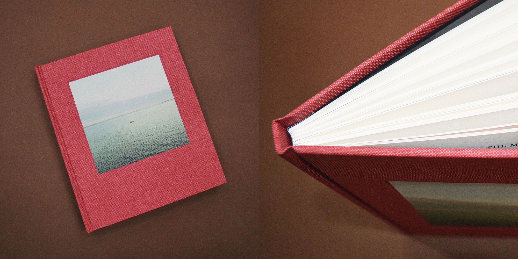
3. Hardcover or case binding
There’s nothing quite like a beautiful book that’s been bound to remarkably high standards of quality. Either section sewn or bound from single sheets, this sturdier option will ensure your book becomes an alluring addition to any coffee table or bookshelf. While a hardcover or casebound book can be more expensive to produce, they do boast a longer shelf life and much higher value.
If you’re planning to sell your work, there really is no substitute. Books bound in a rigid cover and finished with material such as vellum or buckram are often produced with a hollow back and visible joint so as to open more freely.
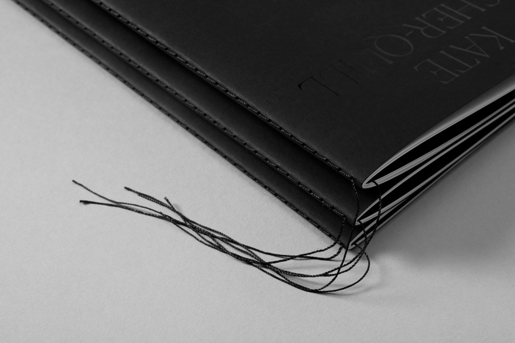
4. Singer sewn binding
Collating pages for a creative project—looking for something a little whimsical? Singer sewing is a beautiful, traditional method of bookbinding where a single thread (of any colour) is stitched through folded pages at the spine. With no adhesives or staples, this secure binding method is typically used on books with a single section. The stitching can either be visible on the outside or tucked neatly away on the inside.
5. Section sewn binding
As the name would suggest, this type of binding is sewn in sections along the spine and glued together for a sturdy finish. Ideal for small and large documents, section sewing enables you to lay your book out flat regardless of its page count.
6. Coptic stitch binding
Like section sewing, you can lay your documents flat with coptic stitching. Although this method is similar in form, a coptic stitch bind offers a non-adhesive finish. Regardless, this type of binding offers a flexible spine without sacrificing strength. It’s an option that allows you to open up your book completely without affecting its integrity over time.
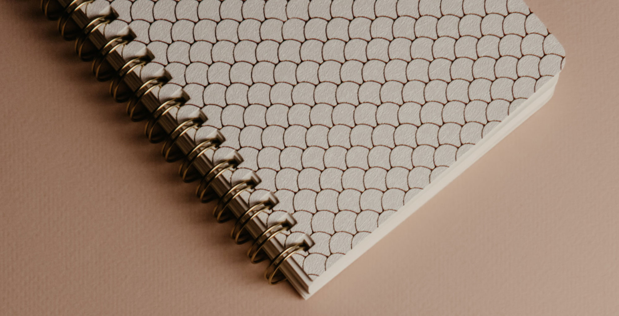
7. Wiro, comb or spiral binding
The quintessential method for commercial documents and school exercise books that involves a simple loop wire and hole puncher. But don’t underestimate the power of a wire, comb or spiral bind. This option is extremely versatile and popular to boot.
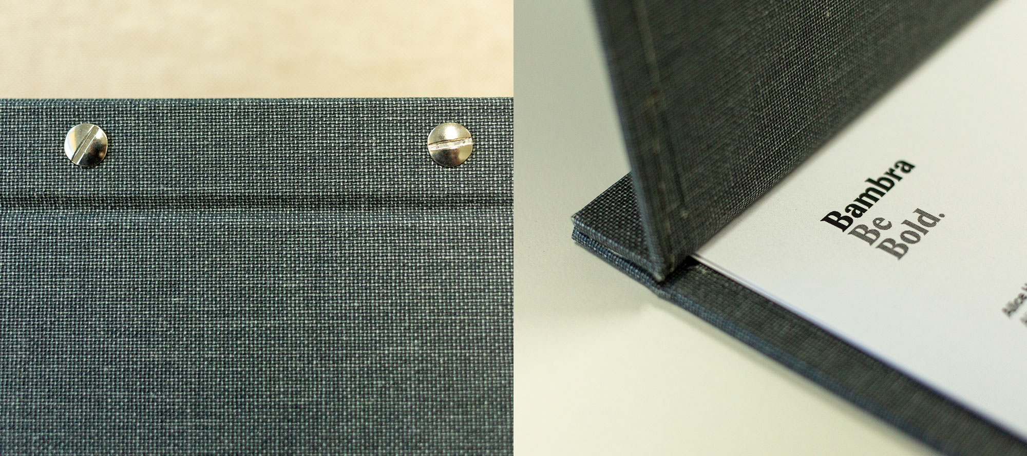
8. Interscrew binding
Also known as Chicago screw binding, this exceptionally durable print finish is a great option for any portfolio or office document. Holes are drilled with the utmost precision and fixed with binding screws between two covering boards. This style of binding is a cleaner looking alternative to ring binding and still gives you the ability to add or remove pages as needed, which is great for restaurant menus and portfolios.
9. Japanese binding
A traditional softcover style of binding in which single leaves are laced together with a needle and thread, with the exposed lacing treated as a feature of the style. This method does not allow the book to be laid flat, but its detail and charm adds heart to any journal or notebook.
10. Solander boxes and slipcases
Solander boxes and slipcases are the ideal way to store your archive and/or precious material. It’s a luxurious form of packaging that can be custom-made to your exact requirements. Choose from a variety of styles (shoebox, matchbox, veranda box, clamshell box or slipcase) and embellish your logo or title with flashy foil or debossing.
Page numbering
I decided to make A5 size booklet. Page one is going to be the cover and page 16, the back of the booklet.
I am going to use saddle stitch binding. I know it’s the simplest way of binding, however , it’s the technique that I’ve got all the resources available.
Designprocess
I used Indesign to make my booklet spreadsheet. As I’m going to use saddle binding I sorted out the pages in the right order. I decided to use my design from exercise 2 as a cover page.
Cover and backPages 2 and 15Pages 3 and 14Pages 4 and 13Pages 5 and 12Pages 6 and 11Pages 7 and 10Pages8 and 9
Final book
Self-reflection
This exercise was very useful for me as it made me more aware of book design process. It is obvious that book design is not just about designing a cover page. In this exercise, I thought about print process and binding in more depth. I just used a home printer so the quality of my work is not very high. However the process was helping me to visualise of what could be a challenge to design a book in a real life.
I just used the equipment I had at home for the binding. I hope I can have a chance to try other techniques as well. I hope I can use whatever I’ve learnt in this exercise in the future.
Research and development A visual narrative is a way of communicating some form of ‘story’. It may be that you interpret ‘narrative’ in a conventional way, using chronological images of how your identity has changed over time, with a beginning, middle and an end. Or perhaps you’ll work in a less obvious way, exploring how your images can be exploited through abstraction and print processes, using the term ‘narrative’ as a vehicle on which to hang your concept of the poem. The purpose is to interpret the brief to create images that are meaningful to you, plus extend your understanding of image qualities. These images may be paintings, photographs, drawings, film stills – they can be at any scale, in any media and about whatever you want them to be, in the context of exploring the concept of the poem. This is your opportunity to explore some of the features of digital imaging software, such as Photoshop, to layer images, cut out images, experiment with opacity, filters, hue, brightness, contrast and halftone screens, among other things. For example, can we approach text as image? What happens if you ‘rasterize’ text, then begin to manipulate it, in the same way as you would montage image material. Be creative! Explore! Remember you have access to Bridgeman and Oxford art libraries online also, if you want to download images and work in this way, but originating your own images will make the project more personal to you.
I used my sketches from last exercise to make my thumbnails.
Thumbnails
Design process
For my designs, I decided to keep them as a series and use the same elements throughout the designs. I used the same colour palette, geometric shapes and the same texture for all my designs.
For the pictures, I used freepik and pexels. I wasn’t sure to add any type or not. At the end I decided to use the “motherland” typeface to add some text to the designs. I used Photoshop to make my designs.
Life is shorter than the squeal of a sparrow.
For the first design, I’ve used an image of a sparrow with open mouth to show it’s squealing. I used some angled lines to echo that. Covered the background with some geometrical shapes. I kept the design simple with limited colour palette. In this stage I wasn’t sure about adding text and the typeface.
Like a dog, regardless, sailing on an ice floe down the river in spring?
For this design, I used two images; a real image of a dog and an illustration of a boat to indicate sailing. Again the geometric shapes have been used with the same colour palette.
With tinned mirth we look at our destiny.
A photo of a road has been used to show the destiny. An image of an angled tin that moving towards the destiny with a photo of a girl laughing to represent mirth. The same colour palette and geometric shapes applied.
We – the discoverers of countries – conquerors of the air – kings of orange groves and cattle.
Images of an illustrated cow, a crown to represent a king and an orange tree have been used. I made the photo at the background B&W then added red colour to make the oranges stand out. I decided to use text with “motherland” typeface, as it is very like a Russian typeface.
Perhaps we will drink a glass of wine to the health of the comets,
For this design, I used an image of a comet and a glass of wine. By using a blending mode, it looks like that the comet is coming from inside the bottle. The texture layer applied on top.
expiring diamond blood.
Images of a diamond and dripping blood have been used with geometric shapes, the whole poem with texture layer on top.
Or better still – we’ll get a record player.
For this part of the poem, I needed an image of a record player. I liked the figure holding the record player so didn’t remove it. Again, geometric shapes and textured layer applied.
Well, to hell with you! – hornless and ironed!
I used a hornless cow with an iron. Used a filter to stretch the back of the iron. Geometric shapes and textured layer applied.
I want one – to dance one tango with cows
I used my illustration of a tango dance as a silhouette at the back in a field with some cows grazing. Removed the colour of the background apart from the cows and added green colour (from the palette) on the trees.
and to build bridges – from the tears of bovine jealousy
An image of an eye used on top of the photo of a bridge, using blending mode. Drops of tears added with blending mode.
to the tears of crimson girls.
I looked for an image of a girl. I removed the colour then added red using blending mode to colour the girl’s dress. Also, some green colour from the palette used to colour the trees in the distance. Again as part of the series, geometric shapes and textured layer applied.
Final designs
The final designs made in Photoshop in size A4.
Mockup
Self – Reflection
I spent a lot of time thinking and organising this exercise. I used my knowledge from previous exercise about the poem and Russian futurist. I read the poem couple of times, made some sketches then the thumbnails.
I didn’t know if I need to keep them as a series or make an individual design. I ended up making them as a series.
I made 11 designs, but used 10 of them in my final booklet.
Concrete poetry, sometimes referred to as visual poetry, is a form of experimental typography where the use of letter and word arrangements enhance the meaning of a poem. The typographic treatment of words within concrete poetry starts to add additional resonances through their scale, placement, overlay and styling, suggesting new ways to see and say the poem. Early examples of concrete poetry were by artists such as Kurt Schwitters and Vasily Kamensky. The development of experimental typography flourished during the 1950s and 1960s with artists such as Dom Sylvester Houédard, Ian Hamilton Finlay and Carl André. Often letterpress and the typewriter were used for experimental typography during this period. “Inspired by the pioneering work of Mallarmé, Apollinaire, the ‘zaum’ poets, Futurism, Dada, and drawing on the more recent example of Lettrism, the central focus of Concrete Poetry was on the written word as a visual phenomenon. Typography was therefore a central concern, with letterform, weight, scale and page layout all contributing to the meaning of the work.” Simon Morley, Writing on the wall: word and image in modern art, 2003. London: Thames & Hudson. “Generally speaking the material of the concrete poem is language: words reduced to their elements of letters (to see) syllables (to hear). Some concrete poets stay with whole words. Others find fragments of letters or individual speech sounds more suited to their needs. The essential is reduced language. The degree of reduction varies from poet to poet, from poem to poem.” MaryEllenSolt,C oncretePoetry:AWorldView,1968.IndianaUniversityPress.
Critical writing task Identify an example of concrete poetry and write a short critique of the content, design and the relationship between the content and form. How has the use of typography, layout, and space been employed to help generate meaning? Print out a copy of the poem and add notes directly onto the page. Write a brief summary of your thoughts, feelings and reflections on how concrete poetry creates new meanings. As a starting point you may want to look at the following artists who practiced Concrete Poetry: ● Dieter Roth ● Max Bense ● Eugen Gomringer ● Ian Hamilton Finlay ● Henri Chopin ● Öyvind Fahlström ● Emmett Williams ● Geraldine Monk ● Mary Ellen Solt ● Ilse Garnier
To explore concrete poetry in more depth you may want to read Mary Ellen Solt’s 1968 Concrete Poetry: A World View, available via UBU: http://www.ubu.com/papers/solt/ Or research the work of individual visual poets at UBU: http://www.ubu.com/vp/
Visual task Use one typeface to create a playful design for the T ango with Cows, 1914, by Russian Futurist Vasily Kamensky (poem shown below). Explore and experiment with the relationship between the meaning of the text and the form you present it. Think about what kind of typeface you choose as well, does it reflect the content of the text? How does the paper relate to the design? Decide on an appropriate scale and format for this page. Create a series of sketches and ideas, and chose one to develop into your final design. Print your design on one of the papers you have collected in the previous exercise.
Poem: Tango With Cows Life is shorter than the squeal of a sparrow. Like a dog, regardless, sailing on an ice floe down the river in spring? With tinned mirth we look at our destiny. We – the discoverers of countries conquerors of the air kings of orange groves and cattle. Perhaps we will drink a glass of wine to the health of the comets, expiring diamond blood. Or better still – we’ll get a record player. Well, to hell with you! hornless and ironed! I want one – to dance one tango with cows and to build bridges from the tears of bovine jealousy to the tears of crimson girls.
Critical writing task
Research – Concrete Poetry
concrete poetry in which the poet’s intent is conveyed by graphic patterns of letters, words, or symbols rather than by the meaning of words in conventional arrangement. The writer of concrete poetry uses typeface and other typographical elementsin such a way that chosen units—letter fragments, punctuation marks, graphemes (letters), morphemes (any meaningful linguistic unit), syllables, or words (usually used in a graphic rather than denotative sense)—and graphic spaces form an evocative picture.
The origins of concrete poetry are roughly contemporary with those of musique concrète, an experimental technique of musical composition. Max Bill and Eugen Gomringer were among the early practitioners of concrete poetry. The Vienna Group of Hans Carl Artmann, Gerhard Rühm, and Konrad Bayer also promoted concrete poetry, as did Ernst Jandl and Friederike Mayröcker. The movement drew inspiration from Dada, Surrealism, and other nonrational 20th-century movements. Concrete poetry has an extreme visual bias and in this way is usually distinguished from pattern poetry. It attempts to move away from a purely verbal concept of verse toward what its proponents call “verbivocovisual expression,” incorporating geometric and graphic elements into the poetic act or process. It often cannot be read aloud to any effect, and its essence lies in its appearance on the page, not in the words or typographic units that form it. At the turn of the 20th century, concrete poetry continued to be produced in many countries. Notable contemporary concrete poets include the brothers Haroldo de Campos and Augusto de Campos. Many contemporary examples of animated concrete poetry can be found on the Internet.
Examples
Analysing
The artist used the word “FORSYTHIA” in an acrostic poem, giving a flower shape by repeating the letters from forsythia like in the Morse code. There are lots of movements by creating branches in different directions. The letters in the main words are quite close. The typeface that is used is serif in two different sizes.
Ian Hamilton Finlay used 3 words in his work: me, you and us. He used a venn diagram as a main shape. I thought, it’s a clever idea to present these three words in a shape of a Venn diagram, as it is showing the relationship between the words. Also, the colours that have been used, are related to the meaning of the words, blue (you) and yellow (me) make green (us).
Reflection
In this exercise, I’ve been introduced to the term “Concrete Poetry”. I’ve never heard of this word, however, I was familiar with the examples. It’s very interesting to see that this kind of design can be used in many different ways to show movement, rhythm and feelings. The design can communicate through the shapes rather than just words. The typeface, capital or lower case letters, punctuations, repetition, scale and spacing can create a specific atmosphere or a new meaning within a design. In some designs, colours have got some meaning too.
Visual task
Research – Tango with Cows
Tango with Cows cover
Tango with Cows by Vasily Kamensky is a key artifact in the history of Russian Futurism, graphic design, visual poetry, and artists’ books. Printed in Moscow in March 1914 on pentagonal sheets of floral wallpaper, all of the book’s poems have a prominent visual form created entirely with typography. The most experimental works in the book—the six so-called “ferroconcrete poems”—dispense with linear order and explore the spatial possibilities of the printed page. The book also includes two illustrations by David Burliuk and one by his brother Vladimir.
Most of the book is about the modern city and modern technology. There are poems about aviation (Kamensky, the first ever poet-aviator, performed exhibition flights before crashing his plane in 1912), the movies, the telephone, the circus, Moscow night clubs, roller skating, and Sergei Shchukin’s collection of modern painting. The poems also make repeated references to the global tango craze of 1913–14.
The extremely innovative typography of all of the poems replaces the conventions of literary typography with those of advertising. Instead of a neutral and unobtrusive design meant to allow words to speak for themselves, the many different sizes and styles of type inflect and structure the reading experience of every poem. Utilizing almost every font of type in the shop of the book’s printer, every letter in the book demands to be seen as well as read.
The ferroconcrete poems depart furthest from literary conventions in that they lack a clear order of reading. The reader is free to explore the page as if it were a painting. In these poems, Kamensky has broken with the temporal linear dimension inherent in speech and has, perhaps for the first time in modern literature, explored the spatial and non-linear affordances of the page.
With the publication of Tango with Cows: Translation, Facsimile, and Commentary it has now been translated into English and recreated for the twenty-first century by Daniel Mellis and Eugene Ostashevsky.
It’s interesting to see that the original book was printed on a wallpaper. I have a collection of wallpaper samples and I was going to use them for my project before reading about this book.
Mind mapping
Typeface
I did try the different typefaces I had on my system and downloaded some. I prefer the “Motherland”. The poet is Russian so I think this typeface would be a good choice.
Sketches
Based on keywords from the poem, I’ve done some sketches. So tried to use them in my thumbnails.
Thumbnails
Looking at my sketches, I would like using the map at the background. It interprets the word “countries” from the poem as well as the cows spots. I will add some images from the keywords as well.
Final design
Self – reflection
In this exercise, I did try to go out of my comfort zone and take my tutors comment on board to go wild and have fun with a task without worrying too much about the quality of my result. I wanted to try some different approaches to my design. I’m not sure if my interpretation of the brief was 100% accurate. About the typeface that I’ve chosen, I can read the text and I thought it’s because I made it myself. I asked some people for their opinion, they needed some time to figure it out. After that they managed to read it.
Personally, I am happy with the result as it was something different compare to my previous design thinkings.
I will need to look into more Concrete Poetry for more examples and different typographical approaches.
To begin: Collect a wide variety of paper samples and other paper ephemera across a range of weights, textures and surface finishes. This builds on your previous paper sample exercise from Part Two. Aim to collect a wide range of unprinted papers, such as blotting paper, tracing paper, lined paper, graph paper, rice paper and handmade papers. Look out for papers with special print finishes – metallic, embossed, shiny and matt. Aim to collect paper that is light as a feather and heavier, more dense, paper. Collect papers that will run through a conventional desktop printer, or indeed the print output options you have available to you – this may include board. In addition, collect paper ephemera that you find interesting or that appeals to you in some way. This may include tickets, flyers and similar printed material or mementos or souvenirs of exhibitions, occasions and days out. Create a stack of these papers for use in your next few exercises.
In your learning log, document some of these papers and their attributes. Use a reflective approach and simple, descriptive words. For example, it may be that a heavy, coarse coloured paper reminds you of primary school, or the particular smell and shine of a paper puts you in mind of glossy magazines, or the fish and chip shop. Document these associations, however bizarre, into your learning log and/or ongoing paper sample book – you may revisit the words and phrases you use here later on in this process.
I’ve ordered a sample book for one of my exercises. There are lots of samples from different weights and different finishes. Now it’s one of my hobbies to look at different samples and finishes and think about the different feels that they can give to the different products.
The collection of the papers that I’ve found at home, are not all printable. However, I am now more aware of the different papers and different textures that I’m able to use for my final assignment.
It’s very interesting that we take the papers around us for granted. Unless we hold them and look at them with extra attention. The textures, weighs and finishes of the papers around us is phenomenal.
In part three, you were asked to look closely into text, image and typography. Your practical work is of a high standard, and you are conducting some good research. Further independent exploration of design is recommended.
A good effort for your third assignment. Your research and preparatory work is extensive, and your mockups are of a high standard. Your good typography book is strong, and it is clear from your use of text and layout that you have a good base level knowledge of typography as well as the skills to apply this knowledge.
My respond to the feedback
Feedback for part 2 was overall very good. My tutor commented on the ‘professional’ standard of some of my work and that some of my research was very thorough.
Overall, I really enjoyed this part of the course. I feel that I now have a better understanding of book design process especially the use of papers and finishes.
I seem to have missed a research task. I’ve definitely done the research tasks but had no idea how to document them. My tutor asked to log something no matter how brief, as it shows that I am engaging with all tasks.
Things that need to be considered:
Documenting my research
Try not to be too precious about some tasks, and to really go wild and have fun with a task without worrying too much about the quality of your result
Find two artists’ books that you feel demonstrate an interesting relationship between their form and content through the materials that the artist has chosen to use. Reflect on these books in your learning log. If you have physical access to libraries such as The British Library, Tate Library Special Collection, or Leeds University Library, visit them and have a look at examples of artists’ books in their special collections. Libraries have online resources as well with access to their collections, for example the V&A National Art Library. Alternatively, return to the The Smithsonian Library’s online archive of artists’ books: h ttps://library.si.edu/collection/artists-books You may also want to reread the Artists’ Book section in Part One of this unit.
I have visited Smithsonian Library before, but didn’t have enough information about the library itself . I found a small video about Smithsonian Library and it’s aims.
Laura Davidson
Guidebook – Museum Nazionale Romano 2011
This is a 4 page accordion book inspired by a visit to the museum in Rome. The cover is painted wood with brass handmade hinges; there is a two sided ink and wash drawn copy of a museum ticket in a vellum holder. The cover image is based on a frescoed room housed in the museum. The inside pages are paper mosaics based upon one mosaic in the museum’s collection. They were created by adding cut paper to a line drawing, and then painting each individual tiny piece of paper. Some images are embellished with 22 c. gold leaf. It is 5.5” high and opens to 15”. Private Collection
Julie Chen
World without end – 1999
“This book was designed, printed & bound by Julie Chen …. It was letterpress printed on a variety of papers, including an assortment of found maps, resulting in each copy being slightly different from every other.”–Colophon. Limited of 25 copies, signed and numbered by the artist. The book and stand are housed in a tray built into a clamshell box (39 x 31 x 5 cm.). The box is covered with rust- and sage-colored diamond-figured cloth and lined with quilted, aqua-colored satin. Title from cover Triangular book fans open, circling back on itself, and fastens front to back to form a diamond-shaped globe. The book-globe is suspended by a metal rod on a crescent-shaped, wooden stand. The text pops forward on printed strips, five to each two-page spread, to form uniform peaks against a backdrop of maps, each overprinted with textual waves. Covers are of handmade paper with twig inclusions. An accordion-folded booklet, attached to the inner box top, shows, through 5 color photographs, the step-by-step assembly.
Analysing
Reflection
Looking at the two books, there are some similarities and differences between them.
The most significant difference is that the “Guidebook” hasn’t got any text apart from the title. The “World without end” is mostly text with some illustration at the background and you cannot see the title on the book.
As similarities, in both artist books the materials that have been used are paper and wood. In both some metals have been used to attach some parts. They both can stand on their own.
Create two books explaining and exploring the typographic and layout principles you have researched in this section. Book 1: My Little Book of…Good Typography Using the reference material that you’ve gathered throughout the exercises and research tasks in Part Three, design a book which explores traditional ‘good practice’ in typography. What is readability and, as a designer, how can you aid it? Visually explain the typographic principles that we’ve touched on in Part Three, such as type size, leading and line length. For example, you could demonstrate kerning by creating a page which looks at letter combinations applying this principle. Equally, explore good layouts and use of grids to help support and frame your typography. This is an opportunity to develop carefully considered design layouts that feel easy and engaging to read, and look at. Be creative in how you do this, developing a range of options and possibilities. Show off your good typography skills as well as talking about what makes good typography in your text. To support this, find quotes and type rules by other typographers and designers – perhaps revisit your research into book designers from part two. Find examples of good typography within book design you can present and talk about. Your booklet should be a celebration of good typography, whatever you think that is. Book 2: My Little Book of…Bad Typography The rules surrounding what constitutes ‘good’ typography are entrenched in tradition and convention, as you demonstrated in Book 1. Having looked at ‘the rules’ surrounding readability and legibility, now is your opportunity to break them! Be inventive and experimental in how you explore what might constitute ‘bad’ typography. For example, negative leading, too-long line length and ‘inappropriate’ application of typographic principles may produce visually jarring and uncomfortable results. What does ‘bad typography’ mean to you and how might it manifest itself? Express your ideas in a visually imaginative way within your second book. This is an opportunity to be playful and push your design layouts, typography and ideas to the limits – celebrate bad typography through your designs and content. Again, find quotations you can work with or examples of bad typography to draw on.
Your books should each take the form of a simple eight-page booklet – folded, stapled or stitched. Design the cover and contents for each. When creating your content for both books, be aware of your audience, and how you might want them to engage with your content. While both these books are about typography, make sure you also include images within the text. These could be your own illustrations, photographs, or stand alone typography pieces that accompany your text. Use a flatplan to organise your content and indicate where important text and images occur, on a recto (right-hand) or verso (left-hand) page, or as a double-page spread. Suggest images by a crossed box, as in the example for ‘front cover’ in the diagram on the previous page. These crossed rectangles indicate image boxes in desktop publishing (DTP) software, and are used in drafts and sketches to signify image material. There is no need to go into detailed drawing regarding text or image material at this stage. Text can be indicated by a series of thick horizontal lines, with main headings sketched in. Use the flatplan to familiarise yourself with the structure of a booklet. Note the blank pages and how they are organised to complement the preceding or following page. Note the extent (number of pages) in the book and whether it has been printed in signatures, or sections.
As with previous assignments, see this as an opportunity to undertake a creative project that is more circular in nature than linear. Visualise initial ideas, assess them and return to your starting point to develop new starting points. Be experimental with your typography and take creative risks along the way. Focus on how you can visually document your creative journey as well as your reflections on what you are producing. Your notes should cover why you decided to portray what you did, what you included and what you omitted. Reflect on how do you feel about the two completed books. For example, are there comparisons you can make between them, has any interesting design issues emerged through the process of making them?
Analysing the brief:
What is the briefasking? 1. My little book of Good Typography . 2. My little book of Bad Typography
Who is the target audience? Anybody who is interested in typography.
Whatthings need to be included? Title, rules, quotes
Howwill it be produced? 8 page booklet x2
Keywords:
2 booklets
8 pages
Folded
Stapled/ sewn
Imagery and type
Primary research:
Typography rules
Quotes
Secondary research
Dimensions
Paper
Typography rules
1. Learn the basics
The first step to more effective typography is to study the nitty-gritty of the art. If you’re new to its principles, you may think typography is just a straightforward practice. The truth is, it’s pretty complex because it’s a combination of art and science. The composition of a typeface consists of specific vocabulary, accurate measurements, and central specifications that should always be identified and taken into consideration. Like with different design forms, you can pull off breaking a rule only if you know it by heart. And it’s only acceptable if you carry it out on purpose to create something of significance. To get a better grip on the basics of typography, spend time studying and learning the art.
2. Take note of font communication
Typeface selection is hardly a random process. Merely searching through your font catalog to choose a font you personally like rarely create an efficient end result. This is because there’s a psychology linked to certain typefaces. When designing, you need to make sure your type is connecting to your audience. This is more than just making certain that your copy is impeccably written. It’s also about ensuring that the font you use fits your market. You wouldn’t use elaborate and rainbow-colored fonts for a law firm brochure, right? That would be better suited for a birthday invitation.
3. Understand kerning
A sloppy kerning job is one of the cardinal sins in the design world. Needless to say, it’s a pivotal skill you must nail down as soon as possible. Kerning is the act of fine-tuning the space between characters to produce a streamlined, unified pairing. It doesn’t sound too important, but an excellent kerning job makes a world of difference. Its main goal is to ensure that the space between each character is aesthetically even to create well-arranged text. Also, programs like Adobe Illustrator can only do so much to automatically fix your kerning blunders. These errors are often subtle, especially with long sentences or paragraphs. But for headlines or logos, a bad kerning job can instantly ruin the whole design.
4. Limit your fonts
One of the common slipups designers – especially newbies – do is using too many fonts and styles. If you need more than one, make sure to limit your fonts to just two to three typefaces. Use one font and size for the body, another for the header, and another for the subhead. Don’t hesitate to choose fonts from different typeface families, as long as there is cohesiveness in the pairing. Working with two very similar fonts can translate as a mistake on your part. Some would think you’re not careful enough and accidently used the wrong font.
5. Practice correct alignment
Alignment is an imperative concept in typography. Many non-designers tend to choose between Center Aligned and Justified, which makes paragraphs quite hard to read. If you’ve used MS Word, you’re already familiar with the four key alignment options: Left Aligned, Center Aligned, Right Aligned, and Justified. Left alignment, aka Flushed Left, is the most common position used in practically everything because it’s easy on the eyes. Using right alignment, aka Flushed Right, to get text nicely arranged on one side only works if it the alignment is used properly. Justified is usually a nightmare for designers. With both Left Aligned and Right Aligned, watch out for ragged lines. These lines are also quite obvious when Center Aligned is used incorrectly. When you see loads of “bumps” in your text, try adjusting the length of the lines.
6. Bring visual hierarchy into play
Typographic hierarchy is the way you stress the significance of certain lines of type as opposed to others. As a result, you establish and move the order in which the audience receives information from the design. This is done by guiding the movement of their eyesight through visual hierarchy. Without using typographic hierarchies, it becomes challenging for readers to promptly identify important pieces of information within the whole design.
7. Work with grids
It can’t be emphasized enough how critical it is to understand and use a design grid. Working with a grid ensures that every little thing on the page is put in relation to something else to produce logical and visual harmony. It’s what makes everything look cohesive and interconnected. Having said that, you don’t have to use grids every time you create something. However, it benefits you a lot if you understand how and why grids are used, particularly when typography is involved.
8. Practice smart pairing
It is possible to make your layout a lot more compelling through typeface pairing. Then again, using too many fonts at the same time can result in everything turning into a distraction. Not to mention, multiple fonts can confuse the audience on which elements of the design are the most important. In general, you should only use a maximum of three fonts per design: the title, the subhead, and the body of the text. You get an exception if your design text is long. In this case, you can choose one or two more fonts.
9. Pick an excellent secondary font for pairing
Font pairing is important to the readability of your design. When you have both a heading and a subhead, use two different typefaces that complement each other to establish visual hierarchy. The challenge with font pairing is to avoid using two contradictory fonts or two very similar fonts where you can barely see a distinction. The second font must be as captivating as the primary typeface without losing the overall uniformity or consistency of the design.
10. Learn to measure
Typographic measuring is used to illustrate the full width of a block of text. Measurement is particularly important when designing a website. Not all fonts are equal to one another, which means different fonts take up different space rations on a web page. The height of a character is referred to as its “x-height.” When you pair fonts, make sure that they have the same “x-height.” The width of a character is called the “set width.” This is what covers the entire body of one letter, plus the space right after it. A “point system” is the arrangement generally used to measure fonts.
11. Prioritise readability
Whatever you design, make sure people can easily read your message. This means dark text on a dark background is a big no-no. Even worse, avoid using a small font over a high-contrast image. You can have a striking design, but all your efforts will go to waste if your text is unintelligible.
12. Choose your font palette wisely
Colour is one of the most powerful tools of a designer. It only makes sense that a carefully set up color scheme is needed to complete a designg. When putting together a font palette, dig into the color theory to pinpoint the right colors intended for your design. For example, orange is thought to increase appetite, which explains why the said color is a widely used in fast food design. There are specific rules and guidelines in terms of colors. And while playing around and thinking outside the box can produce a one-of-a-kind, punchy design, make sure your font colors are not too distracting, making your message confusing.
13. Get a handle on “widows” and “orphans”
One of the easiest ways to take your design to the next level is to identify and wipe out widows and/or orphans. A typographical widow is a line of text that is part of a paragraph, but has shifted over to the next column. An orphan is basically the same with an exception that there’s only a single word left on its own. It’s almost inevitable for widows and orphans to show up in any type-centered designs, so you must know how to correctly deal with them. There are several techniques to manage widows and orphans. You can do a manual text edit to modify the length of the lines to completely eliminate the problem. You can also adjust the text box or the column size to enable the type to maneuver around the orphans and widows.
14. Avoid stretching fonts
This is a very simple rule often overlooked by many designers, even the pros. In general, fonts are created with meticulous attention to the details (shapes and measurements) of every letterform. Stretching a font takes away its efficiency and value. A common reason people stretch their fonts is to make them a bit taller or wider. There’s a way to do this without distorting the typeface. You can choose tall or wide fonts from the seemingly endless supply of fonts online. Some come with a price, others are for free.
15. Keep in mind that white space is NOT an empty space
White space is a distinctive and valuable tool that can bring out something special from your design. A smartly-used white space provides several beneficial effects. It helps put more focus on a particular part of your composition. It lets the design ‘breathe.’ It stabilizes design components. It adds a level of sophistication to the design effortlessly. Without adding a new element, white space can convey multiple meanings to the design. Let’s say you’re designing a poster for noise-canceling headphones. By simply placing the headphones on the canvas without additional elements, the white space highlights the gadget. It lets the headphones be the sole focus of the design. More than that, the white space visually translates how the gadget cancels outside noise because there are no other elements added.
16. Use and treat typography as art
Quit thinking of typography as just the font(s) used on the text complementary to your design. Fonts are carefully fashioned and thus requires a level of artistry that becomes a valuable advantage to your design toolbox. This is beyond constructing plain text. It’s about treating fonts as a form of art. In order to produce a one-of-a-kind, text-centered design, think of how you can make eye-catching fonts as the design hero. Also, don’t feel like you’re limited by the composition of existing typefaces. Explore and expand your search to find the perfect one that will suit your needs. Then add swirls, textures, lines, and anything else cool, quirky, or fun to elevate the look and feel of the font.
17. Refrain from using design fads
At times, design is like fashion with its never-ending fads and gimmicks. Trends come and go. Today, they are hugely popular; tomorrow, they are forgotten. And once the luster of the trend is gone, everything curated around it quickly becomes outdated and ineffective. New design styles and/or methods fluctuate too. Some designers are quick to jump on the bandwagon since a new trend is exciting and easy to copy. But as quickly as trends dominate the design world, they also leave abruptly. So the logo you just created a year ago that’s supposed to last for many years is now considered dull and old-fashioned. Having said that, you must also be aware of the font trends that dominate your niche. Monitor the popular ones and study them to understand why they become prevalent. Studying the trends means learning how to analyze design components. Try to size them up, but avoid jumping aboard any bandwagon without careful consideration.
18. Work with the right tools
In the same way that a carpenter wouldn’t use a screwdriver to hammer a nail, a designer must know what tools fit the task. Even more importantly, you must know what tools you shouldn’t touch. There are a lot of typography programs available online to help you determine the best tools for certain procedures. The most popular ones are designed by Adobe. Keep in mind that paid tools can be a bit pricey, so make a product comparison to know which tools you need to buy and which ones you can bypass.
19. Adhere to grammar rules
Grammar can be a confusing and tricky design component since there are tons of hidden rules you may not be aware of. Making the effort to find out and learn the design-oriented grammar rules can help you create a professional-looking design. The three grammar pitfalls you must pay extra attention to are ampersands, double spaces after punctuation, and hyphens and dashes. There are various guidelines for design-specific sentence structure. And while it may seem like a trivial thing to know, most designers would claim otherwise. Correct grammar is a subtle but potent tool that can elevate your design to a completely new level of professionalism as it displays keen attention to detail.
20. Find something that inspires you
Just like everything else in life, having inspiration goes a long way. The best way to learn how to create efficient and appealing typography is to study existing typeface illustrations. Figure out what makes them engaging and effective. You can find tons of articles online about design inspiration. But the World Wide Web is not just the only place to get you inspired. You can spark the flame of your passion with your surroundings. Try to spot fonts — and graphics — that catch your attention, things that make you want to step up your game.
Quotes
Typography is the craft of endowing human language with a durable visual form.” ― Robert Bringhurst, of beautiful letters.” ― Matthew Carter
“Form and function together create typographic excellence.”― R. Roger Remington
“The beauty of type lies in its utility; prettiness without readability serves neither author nor reader.”― James Felici
“Typography is a hidden tool of manipulation within society.”― Neville Brody
“Typography is to literature as musical performance is to composition: an essential act of interpretation, full of endless opportunities for insight or obtuseness.”― Robert Bringhurst, ‘The Elements Of Typographic Style’
“Type is what meaning looks like.”― Max Phillips
“Good typography can help your reader devote less attention to the mechanics of reading and more attention to your message.”— Matthew Butterick
“For me, typography is a triangular relationship between design idea, typographic elements, and printing technique.”― Wolfgang Weingart
“Typography is two-dimensional architecture, based on experience and imagination, and guided by rules and readability.”― Hermann Zapf
Every page should explode, either because of its staggering absurdity, the enthusiasm of its principles, or its typography.”— Tristan Tzara
“The beauty of type lies in its utility; prettiness without readability serves neither author nor reader.”― James Felici
Dimensions
The brief didn’t ask for any specific dimensions, so I decided to choose a pocket size dimension ( 4.25 X 6.87 inches) for my books. Pocket books fits snugly into the back pocket. They are easy to carry around and cheap to print and as such they are used for cheaper paperback fiction. They are to be found in airports, newsagents and bookstores.
Paper
As it’s a pocket book it needs to be durable enough. So I thought the paper needs to be at least 250gsm thick and it needs some sort of coating for protection. Based on the research I had in previous part about different types of papers and coats, I would chose silk paper with Matt lamination with spot UV gloss for the cover (probably the words GOOD and BAD. Uncoated recycled paper for the inner pages to reduce the cost and make more environmental friendly.
Mind mapping
I gathered all the features that I could think for a good typography. For the bad typography, I will use the opposite of these features.
Flat plans
I chose 6 rules out of the rules that I have found earlier to include in my books:
visual hierarchy
Limit your fonts
white space is NOT an empty space
smart pairing
Understand kerning
correct alignment/ avoid orphans and widows
I thought I can add three rules in my good typography book and another three rules in my bad typography book with some examples and quotes.
Colour palette
For the “Good Typography” book, I would like to choose green colours and for the “Bad Typography” book, red colours. I found some colour examples from Adobe color.
Design process
I used Illustrator to design my cover. I used golden ratio as a grid.
Then used InDesign to design the whole book. For the “Good Typography” book, I made an 8 pages document (4.25 in x 6.78 in) with margins: 4 picas up, left and right margins, 6 picas for the bottom margin. I wanted to have a generous margin all around as it’s a pocket book and needed space for the fingers to hold the book.
I used 4 x 4 grid for inside the book. I decided to have a minimal approach to my design. Just used 2 typefaces: Raleway and Didot for the “Good Typography” book.
For the “Bad Typography” book, I decided to include 3 more rules and more quotes about typography. However, I wanted to break all the design rules in a very extreme way to present it: using lots of different illegible fonts, not using grid …
Final designs
Mockups
Self – reflection
I really enjoyed working on this assignment. For the start, I wasn’t quite sure how the result will be. But I should say after lots of thought and consideration about the design elements, I’m happy with the outcome.
I was struggling with the “Bad Typography” book, as everything I’ve learnt and practiced was based on design rules. I did try to break the rules in a very extreme way. I should say that the second book is more about a bad design book.
The information for the book was another challenge. I decided to stick to typography rules and quotes from famous designers. So, I was able to concentrate more on design aspects.
Probably with more time, I could do more research on different types of books, make more thumbnails and try more ideas for my designs.
Below is an extract from Jules Verne’s 20,000 Leagues Under the Sea. Using a single typeface of your choice, lay out the text in as inventive a way as possible. Experiment with the letters and words, using the typographic principles you researched in earlier exercises to significantly alter the arrangement of the text, its rhythm and readability. Think about design group Tomato’s definition of typography – ‘Sound as form’ – and how this concept might apply to your own work. Use the content of the text to inspire visual ideas. How might you experiment with the type to communicate something of the essence of the descriptive content? Think about how the designers you researched in the previous section, e.g. David Carson and El Lissitsky, would approach the text – or artists like Marinetti and Schwitters. It is important that you play with the text, with individual letters and words. How experimental can you be in making expressive typographic designs? Can you reveal something of the character and nature of the letterform by experimenting with scale and orientation, so a simple unassuming letter becomes a monumental, almost sculptural form? Think about the sound of the words you are working with, how can your typographic decisions help to communicate these? As a book designer, you might be more drawn to analog or digital ways of working. Whatever your preference, try to mix and match both approaches. Your work on paper might become a starting point for digital experimentation with this text, or print out your initial ideas, so that you can experiment with what happens when you start to cut, collage or physically alter your text in some way. This physical work can then be scanned to kick start a new digital stage. Read the text through once before starting to manipulate the type. Make several designed versions of this passage, or parts of it, spanning several pages if need be. Feel free to focus on certain aspects of the text, or use the whole text within your designs. Use your learning log to reflect your creative decision making as well as sharing the various stages of your process.
I’ve downloaded chapter 1 of the book and uploaded some part of it.
PART ONE
CHAPTER I A SHIFTING REEF
The year 1866 was signalised by a remarkable incident, a mysterious and puzzling phenomenon, which doubtless no one has yet forgotten. Not to mention rumours which agitated the maritime population and excited the public mind, even in the interior of continents, seafaring men were particularly excited. Merchants, common sailors, captains of vessels, skippers, both of Europe and America, naval officers of all countries, and the Governments of several states on the two continents, were deeply interested in the matter.
For some time past, vessels had been met by “an enormous thing,” a long object, spindle-shaped, occasionally phosphorescent, and infinitely larger and more rapid in its movements than a whale.
The facts relating to this apparition (entered in various log-books) agreed in most respects as to the shape of the object or creature in question, the untiring rapidity of its movements, its surprising power of locomotion, and the peculiar life with which it seemed endowed. If it was a cetacean, it surpassed in size all those hitherto classified in science. Taking into consideration the mean of observations made at divers times,—rejecting the timid estimate of those who assigned to this object a length of two hundred feet, equally with the exaggerated opinions which set it down as a mile in width and three in length,—we might fairly conclude that this mysterious being surpassed greatly all dimensions admitted by the ichthyologists of the day, if it existed at all. And that it did exist was an undeniable fact; and, with that tendency which disposes the human mind in favour of the marvellous, we can understand the excitement produced in the entire world by this supernatural apparition. As to classing it in the list of fables, the idea was out of the question.
Similar facts were observed on the 23rd of July in the same year, in the Pacific Ocean, by the Columbus, of the West India and Pacific Steam Navigation Company. But this extraordinary cetaceous creature could transport itself from one place to another with surprising velocity; as, in an interval of three days, the Governor Higginson and the Columbus had observed it at two different points of the chart, separated by a distance of more than seven hundred nautical leagues.
Thumbnails
I decided to concentrate on sea and the designs related to that.
Inspiration
Designs
For the first design, I’ve used water drops and put the letters inside them and used the blur effect.
For the second design, I was thinking about a whirlpool effect.
The third design is representing waves in the sea. I used the text from the first chapter of the book as a background.
The last design is based on the sea and waves. I used part of the text again to write on path.
Self – reflection
Interesting exercise, as I needed to experience different approaches to my designs. I had different ideas and I tried to concentrate on couple of them to be able to work on them and improve the concept. I decided to keep the design black and white and just concentrate on typography. This exercise really helped me to think about typography as an illustration.