Brief
For this assignment you will redesign the corporate identity for a traditional confectionery company. The objective is to modernise the design of the identity while keeping the heart of the brand. You will select a company that has a wide selection of products and has established its brand for many decades – or at least multiple years.
- Research the modern confectionery landscape.
Research the industry, and sector. Who are the competitors? What products are available in the shops next to this company’s products? What are customers deciding between when they are making the decision to purchase a certain brand?
- Select an existing company.
Research the brand values, what the company stands for and how the brand is perceived by customers. Research the family of products the brand distributes – are the products aligned and clearly related to the parent brand? Explore the current corporate identity or any previous identity designs and redesigns. Look at visuals as well as news reports, public relations statements, and social media channels. Compile this research in your learning log.
- Explore different directions.
Draft ideas for at least three different directions that the corporate identity might evolve. One direction might be an attempt to stay exactly the same while modernising, another might be to create an identity that will better align with the changes in the industry or sector, and a third might be an exploration of how the company will differentiate within the sector.
- Develop one of the directions.
Select one of the three (or more) directions you explored and develop this further. Based on what you know about the brand and the competitive landscape, design a corporate identity that will differentiate this company from the competition while staying true to the original values and brand promise. Refine the visuals, rationalise your choices, and support your decision with the research you conducted. Demonstrate how the new identity will translate across three specific products the company manufactures.
- Prepare a corporate identity brand guide.
This document will serve as the source of truth for the company going forward. It will be a reference manual for the marketing and PR teams, it will inform the presentations at strategy meetings, and it will be the benchmark against which new products are introduced.
The design process that you should use throughout the unit and consists of the following:
- First stage — initial idea generation and visual experiments (both based on your research).
- Second stage — idea development and testing.
- Third stage — idea selection and refinement.
- Final stage — reflection.
Analysing the brief

Research
I started by researching the 10 top confectionary companies in the world and in the UK.


The History of Cadbury’s Brand Identity
Cadbury, one of the world’s most iconic confectionery brands, has a rich history of evolving its brand identity while maintaining its core values of quality, generosity, and heritage. Here’s an overview of how Cadbury’s brand identity has transformed since its founding:
Founding and Early Years (1824–1900s)
Cadbury was established in 1824 in Birmingham, England, by John Cadbury, who initially sold tea, coffee, and drinking chocolate. The early branding was utilitarian, focused on product quality and serving the needs of an industrializing society. Cadbury products were packaged plainly, reflecting the values of the Quaker family behind the business: integrity and simplicity.
In 1866, Cadbury introduced their first cocoa press, allowing for the production of “pure” cocoa—a revolutionary move that formed the foundation of their reputation for quality. By the late 19th century, Cadbury was using more elaborate designs and gold embellishments on packaging to convey luxury and high standards.
The Rise of Purple and Victorian Elegance (1900s–1920s)
The early 20th century saw Cadbury adopt the now-famous purple color, officially Pantone 2685C, which became synonymous with the brand. Purple was chosen as a tribute to Queen Victoria, symbolizing luxury and royalty.
During this time, the script logo, which resembled William Cadbury’s signature, made its debut. This hand-written style was used to give the brand a personal, trustworthy identity.
Expansion and Modernization (1930s–1950s)
In the mid-20th century, Cadbury evolved its identity to appeal to a wider, global audience. The branding became more consistent, and the signature logo was streamlined for clarity. Cadbury’s Dairy Milk, launched in 1905, became a flagship product, with the purple packaging and gold accents emphasizing its premium quality.
The tagline “Glass and a Half” was introduced during this period, symbolizing the generosity of ingredients in Dairy Milk—a theme that would define the brand for decades.
Post-War Era and Pop Culture (1960s–1980s)
With the rise of television and pop culture, Cadbury began emphasizing fun and innovation. The brand identity leaned into bright colors, playful designs, and jingles to market products like Cadbury Creme Egg and Flake. Advertising campaigns became a central part of Cadbury’s identity, reflecting the joy and indulgence of chocolate.
The logo remained largely unchanged, preserving its heritage, but the packaging became bolder, catering to changing consumer tastes.
Globalization and Streamlining (1990s–2000s)
As Cadbury expanded globally, it worked to unify its brand identity across markets. The purple color, script logo, and “Glass and a Half” symbol became universally recognized trademarks. During this era, Cadbury emphasized its British heritage and commitment to quality in a more cohesive way.
However, challenges arose when Kraft Foods acquired Cadbury in 2010. Concerns over preserving Cadbury’s identity and values were addressed by maintaining the core elements of the brand’s design and messaging.
The Modern Era (2010s–Present)
Today, Cadbury’s brand identity is centered on themes of generosity and joy. The brand’s recent campaigns, such as the “There’s a Glass and a Half in Everyone” slogan, focus on emotional connections and community spirit. The purple remains dominant, while the signature logo has been subtly refined to ensure modernity without losing its heritage.
Sustainability has also become a key aspect of Cadbury’s identity. Initiatives like using responsibly sourced cocoa through the Cocoa Life program highlight a modern commitment to ethical practices while resonating with socially conscious consumers.
Key Elements of Cadbury’s Brand Identity
- Colour: Cadbury Purple (Pantone 2685C) is central to its identity, symbolizing luxury and tradition.
- Logo: The script-style logo, based on William Cadbury’s signature, reflects authenticity and trust.
- Taglines: “Glass and a Half” emphasizes generosity, while newer campaigns focus on joy and community.
- Heritage: Its British roots and Quaker values of integrity and quality remain core to the brand’s image.


Analysis of Cadbury’s Brand Identity
Cadbury is a globally recognised brand known for its chocolate and confectionery products. Its brand identity is shaped by several key elements that make it distinctive and resonate with consumers worldwide.
1. Core Values
- Heritage and Tradition: Cadbury, founded in 1824, emphasises its long-standing tradition of producing high-quality chocolates. Its British roots and association with family values and care are integral to its identity.
- Quality and Trust: Cadbury is synonymous with high-quality products, supported by its commitment to using premium ingredients. Trust has been built over decades of consistent performance.
2. Visual Identity
- Logo: Cadbury’s iconic script logo, introduced in 1921, has remained a symbol of authenticity and tradition. The cursive style conveys warmth and personalisation.
- Colour Palette: The signature “Cadbury Purple” (Pantone 2685C) is central to its visual identity, symbolising luxury, indulgence, and royalty.
- Packaging: Cadbury uses clean and inviting designs, often featuring flowing lines that evoke smoothness and richness, mirroring the chocolate’s texture.
3. Tone and Messaging
- Cadbury communicates in a friendly, inclusive, and approachable tone.
- Its messaging often revolves around moments of joy, love, and connection. For instance, its advertisements focus on sharing chocolates with loved ones and creating small moments of happiness.
4. Emotional Appeal
- Nostalgia: Many Cadbury campaigns tap into childhood memories and traditions, creating a strong emotional connection.
- Relatability: The brand emphasises everyday life moments, making it feel accessible and relatable across cultures.
5. Innovations and Adaptations
- Cadbury has consistently innovated its product range to stay relevant, introducing items like Cadbury Dairy Milk Silk and Cadbury Darkmilk to appeal to different tastes.
- Regional adaptations, such as festive packaging and flavors, strengthen its connection with diverse markets.
Mind mapping

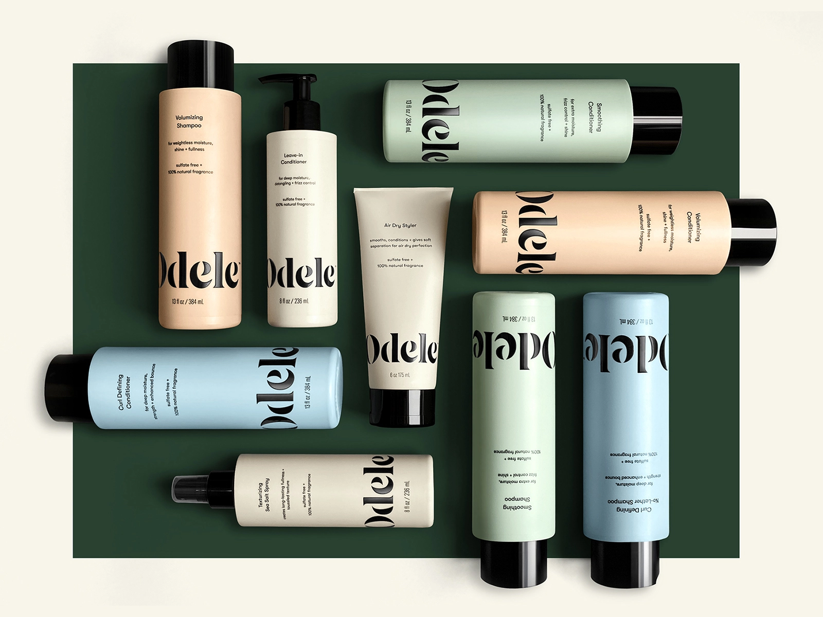
Mood board – logo

Mood board – chocolate packaging

Thumbnails


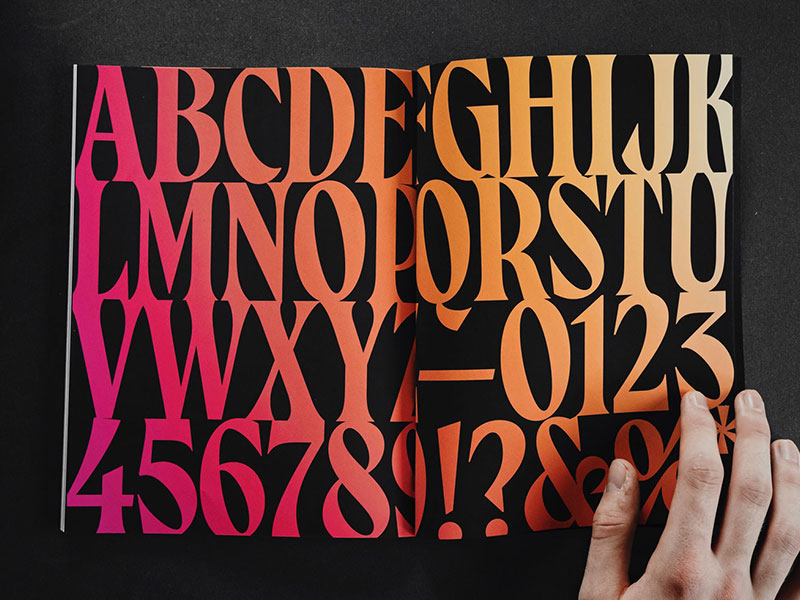
Typeface


Design process
Textures


Final designs


Mock ups


Self-reflection
To redesign Cadbury’s corporate identity, my approach was centered on modernising the brand while elevating its sense of luxury. Cadbury is widely recognised and loved for its history and comforting chocolate products, but I felt that its existing identity did not fully reflect the high quality and sophistication of its chocolate. By reimagining the brand, I aimed to preserve its warmth and approachability while creating a more premium aesthetic that aligns with its superior product offerings.
One of the key changes I implemented was in the colour palette. I opted for a refined and sophisticated combination of dark brown and gold, which not only reflects the richness of chocolate but also conveys a sense of indulgence and luxury. This choice was intentional to elevate Cadbury’s image while maintaining its connection to its heritage as a seller of fine chocolate.
The typeface I selected also plays a vital role in the redesign. I chose a modern, elegant typeface with clean lines and a touch of sophistication to enhance the brand’s premium feel. The updated typography complements the colour palette and creates a cohesive, polished look.
To add depth and visual interest, I incorporated textures and illustrations into the design. The use of watercolour illustrations of cocoa beans brings an authentic touch, reminding consumers of Cadbury’s commitment to quality and its connection to the raw ingredients that make its products so special. These elements also introduce a handcrafted, boutique feel that enhances the brand’s luxurious appeal.
Overall, my redesign balances Cadbury’s historical legacy with modern design sensibilities. It respects the brand’s origins while appealing to contemporary consumers who seek both quality and sophistication in their chocolate experience. Through this approach, I aimed to create a corporate identity that feels timeless yet forward-thinking, reinforcing Cadbury’s position as a leader in the confectionery industry.
Resources
- Cadbury (2024). Available at: https://www.cadbury.co.uk. (Accessed: 16 November 2024)
- Google images (2024). Available at: https://images.google.co.uk. Accessed: 16 November 2024)
- Snack and bakery (2024). Candy industry. Available at: https://www.snackandbakery.com/candy-industry/2021/global-top-100-candy-companies. (Accessed: 16 November 2024)