In part three, you were asked to look closely into text, image and typography. Your practical work is of a high standard, and you are conducting some good research. Further independent exploration of design is recommended.
A good effort for your third assignment. Your research and preparatory work is extensive, and your mockups are of a high standard. Your good typography book is strong, and it is clear from your use of text and layout that you have a good base level knowledge of typography as well as the skills to apply this knowledge.
My respond to the feedback
Feedback for part 2 was overall very good. My tutor commented on the ‘professional’ standard of some of my work and that some of my research was very thorough.
Overall, I really enjoyed this part of the course. I feel that I now have a better understanding of book design process especially the use of papers and finishes.
I seem to have missed a research task. I’ve definitely done the research tasks but had no idea how to document them. My tutor asked to log something no matter how brief, as it shows that I am engaging with all tasks.
Things that need to be considered:
Documenting my research
Try not to be too precious about some tasks, and to really go wild and have fun with a task without worrying too much about the quality of your result
Find two artists’ books that you feel demonstrate an interesting relationship between their form and content through the materials that the artist has chosen to use. Reflect on these books in your learning log. If you have physical access to libraries such as The British Library, Tate Library Special Collection, or Leeds University Library, visit them and have a look at examples of artists’ books in their special collections. Libraries have online resources as well with access to their collections, for example the V&A National Art Library. Alternatively, return to the The Smithsonian Library’s online archive of artists’ books: h ttps://library.si.edu/collection/artists-books You may also want to reread the Artists’ Book section in Part One of this unit.
I have visited Smithsonian Library before, but didn’t have enough information about the library itself . I found a small video about Smithsonian Library and it’s aims.
Laura Davidson
Guidebook – Museum Nazionale Romano 2011
This is a 4 page accordion book inspired by a visit to the museum in Rome. The cover is painted wood with brass handmade hinges; there is a two sided ink and wash drawn copy of a museum ticket in a vellum holder. The cover image is based on a frescoed room housed in the museum. The inside pages are paper mosaics based upon one mosaic in the museum’s collection. They were created by adding cut paper to a line drawing, and then painting each individual tiny piece of paper. Some images are embellished with 22 c. gold leaf. It is 5.5” high and opens to 15”. Private Collection
Julie Chen
World without end – 1999
“This book was designed, printed & bound by Julie Chen …. It was letterpress printed on a variety of papers, including an assortment of found maps, resulting in each copy being slightly different from every other.”–Colophon. Limited of 25 copies, signed and numbered by the artist. The book and stand are housed in a tray built into a clamshell box (39 x 31 x 5 cm.). The box is covered with rust- and sage-colored diamond-figured cloth and lined with quilted, aqua-colored satin. Title from cover Triangular book fans open, circling back on itself, and fastens front to back to form a diamond-shaped globe. The book-globe is suspended by a metal rod on a crescent-shaped, wooden stand. The text pops forward on printed strips, five to each two-page spread, to form uniform peaks against a backdrop of maps, each overprinted with textual waves. Covers are of handmade paper with twig inclusions. An accordion-folded booklet, attached to the inner box top, shows, through 5 color photographs, the step-by-step assembly.
Analysing
Reflection
Looking at the two books, there are some similarities and differences between them.
The most significant difference is that the “Guidebook” hasn’t got any text apart from the title. The “World without end” is mostly text with some illustration at the background and you cannot see the title on the book.
As similarities, in both artist books the materials that have been used are paper and wood. In both some metals have been used to attach some parts. They both can stand on their own.
Create two books explaining and exploring the typographic and layout principles you have researched in this section. Book 1: My Little Book of…Good Typography Using the reference material that you’ve gathered throughout the exercises and research tasks in Part Three, design a book which explores traditional ‘good practice’ in typography. What is readability and, as a designer, how can you aid it? Visually explain the typographic principles that we’ve touched on in Part Three, such as type size, leading and line length. For example, you could demonstrate kerning by creating a page which looks at letter combinations applying this principle. Equally, explore good layouts and use of grids to help support and frame your typography. This is an opportunity to develop carefully considered design layouts that feel easy and engaging to read, and look at. Be creative in how you do this, developing a range of options and possibilities. Show off your good typography skills as well as talking about what makes good typography in your text. To support this, find quotes and type rules by other typographers and designers – perhaps revisit your research into book designers from part two. Find examples of good typography within book design you can present and talk about. Your booklet should be a celebration of good typography, whatever you think that is. Book 2: My Little Book of…Bad Typography The rules surrounding what constitutes ‘good’ typography are entrenched in tradition and convention, as you demonstrated in Book 1. Having looked at ‘the rules’ surrounding readability and legibility, now is your opportunity to break them! Be inventive and experimental in how you explore what might constitute ‘bad’ typography. For example, negative leading, too-long line length and ‘inappropriate’ application of typographic principles may produce visually jarring and uncomfortable results. What does ‘bad typography’ mean to you and how might it manifest itself? Express your ideas in a visually imaginative way within your second book. This is an opportunity to be playful and push your design layouts, typography and ideas to the limits – celebrate bad typography through your designs and content. Again, find quotations you can work with or examples of bad typography to draw on.
Your books should each take the form of a simple eight-page booklet – folded, stapled or stitched. Design the cover and contents for each. When creating your content for both books, be aware of your audience, and how you might want them to engage with your content. While both these books are about typography, make sure you also include images within the text. These could be your own illustrations, photographs, or stand alone typography pieces that accompany your text. Use a flatplan to organise your content and indicate where important text and images occur, on a recto (right-hand) or verso (left-hand) page, or as a double-page spread. Suggest images by a crossed box, as in the example for ‘front cover’ in the diagram on the previous page. These crossed rectangles indicate image boxes in desktop publishing (DTP) software, and are used in drafts and sketches to signify image material. There is no need to go into detailed drawing regarding text or image material at this stage. Text can be indicated by a series of thick horizontal lines, with main headings sketched in. Use the flatplan to familiarise yourself with the structure of a booklet. Note the blank pages and how they are organised to complement the preceding or following page. Note the extent (number of pages) in the book and whether it has been printed in signatures, or sections.
As with previous assignments, see this as an opportunity to undertake a creative project that is more circular in nature than linear. Visualise initial ideas, assess them and return to your starting point to develop new starting points. Be experimental with your typography and take creative risks along the way. Focus on how you can visually document your creative journey as well as your reflections on what you are producing. Your notes should cover why you decided to portray what you did, what you included and what you omitted. Reflect on how do you feel about the two completed books. For example, are there comparisons you can make between them, has any interesting design issues emerged through the process of making them?
Analysing the brief:
What is the briefasking? 1. My little book of Good Typography . 2. My little book of Bad Typography
Who is the target audience? Anybody who is interested in typography.
Whatthings need to be included? Title, rules, quotes
Howwill it be produced? 8 page booklet x2
Keywords:
2 booklets
8 pages
Folded
Stapled/ sewn
Imagery and type
Primary research:
Typography rules
Quotes
Secondary research
Dimensions
Paper
Typography rules
1. Learn the basics
The first step to more effective typography is to study the nitty-gritty of the art. If you’re new to its principles, you may think typography is just a straightforward practice. The truth is, it’s pretty complex because it’s a combination of art and science. The composition of a typeface consists of specific vocabulary, accurate measurements, and central specifications that should always be identified and taken into consideration. Like with different design forms, you can pull off breaking a rule only if you know it by heart. And it’s only acceptable if you carry it out on purpose to create something of significance. To get a better grip on the basics of typography, spend time studying and learning the art.
2. Take note of font communication
Typeface selection is hardly a random process. Merely searching through your font catalog to choose a font you personally like rarely create an efficient end result. This is because there’s a psychology linked to certain typefaces. When designing, you need to make sure your type is connecting to your audience. This is more than just making certain that your copy is impeccably written. It’s also about ensuring that the font you use fits your market. You wouldn’t use elaborate and rainbow-colored fonts for a law firm brochure, right? That would be better suited for a birthday invitation.
3. Understand kerning
A sloppy kerning job is one of the cardinal sins in the design world. Needless to say, it’s a pivotal skill you must nail down as soon as possible. Kerning is the act of fine-tuning the space between characters to produce a streamlined, unified pairing. It doesn’t sound too important, but an excellent kerning job makes a world of difference. Its main goal is to ensure that the space between each character is aesthetically even to create well-arranged text. Also, programs like Adobe Illustrator can only do so much to automatically fix your kerning blunders. These errors are often subtle, especially with long sentences or paragraphs. But for headlines or logos, a bad kerning job can instantly ruin the whole design.
4. Limit your fonts
One of the common slipups designers – especially newbies – do is using too many fonts and styles. If you need more than one, make sure to limit your fonts to just two to three typefaces. Use one font and size for the body, another for the header, and another for the subhead. Don’t hesitate to choose fonts from different typeface families, as long as there is cohesiveness in the pairing. Working with two very similar fonts can translate as a mistake on your part. Some would think you’re not careful enough and accidently used the wrong font.
5. Practice correct alignment
Alignment is an imperative concept in typography. Many non-designers tend to choose between Center Aligned and Justified, which makes paragraphs quite hard to read. If you’ve used MS Word, you’re already familiar with the four key alignment options: Left Aligned, Center Aligned, Right Aligned, and Justified. Left alignment, aka Flushed Left, is the most common position used in practically everything because it’s easy on the eyes. Using right alignment, aka Flushed Right, to get text nicely arranged on one side only works if it the alignment is used properly. Justified is usually a nightmare for designers. With both Left Aligned and Right Aligned, watch out for ragged lines. These lines are also quite obvious when Center Aligned is used incorrectly. When you see loads of “bumps” in your text, try adjusting the length of the lines.
6. Bring visual hierarchy into play
Typographic hierarchy is the way you stress the significance of certain lines of type as opposed to others. As a result, you establish and move the order in which the audience receives information from the design. This is done by guiding the movement of their eyesight through visual hierarchy. Without using typographic hierarchies, it becomes challenging for readers to promptly identify important pieces of information within the whole design.
7. Work with grids
It can’t be emphasized enough how critical it is to understand and use a design grid. Working with a grid ensures that every little thing on the page is put in relation to something else to produce logical and visual harmony. It’s what makes everything look cohesive and interconnected. Having said that, you don’t have to use grids every time you create something. However, it benefits you a lot if you understand how and why grids are used, particularly when typography is involved.
8. Practice smart pairing
It is possible to make your layout a lot more compelling through typeface pairing. Then again, using too many fonts at the same time can result in everything turning into a distraction. Not to mention, multiple fonts can confuse the audience on which elements of the design are the most important. In general, you should only use a maximum of three fonts per design: the title, the subhead, and the body of the text. You get an exception if your design text is long. In this case, you can choose one or two more fonts.
9. Pick an excellent secondary font for pairing
Font pairing is important to the readability of your design. When you have both a heading and a subhead, use two different typefaces that complement each other to establish visual hierarchy. The challenge with font pairing is to avoid using two contradictory fonts or two very similar fonts where you can barely see a distinction. The second font must be as captivating as the primary typeface without losing the overall uniformity or consistency of the design.
10. Learn to measure
Typographic measuring is used to illustrate the full width of a block of text. Measurement is particularly important when designing a website. Not all fonts are equal to one another, which means different fonts take up different space rations on a web page. The height of a character is referred to as its “x-height.” When you pair fonts, make sure that they have the same “x-height.” The width of a character is called the “set width.” This is what covers the entire body of one letter, plus the space right after it. A “point system” is the arrangement generally used to measure fonts.
11. Prioritise readability
Whatever you design, make sure people can easily read your message. This means dark text on a dark background is a big no-no. Even worse, avoid using a small font over a high-contrast image. You can have a striking design, but all your efforts will go to waste if your text is unintelligible.
12. Choose your font palette wisely
Colour is one of the most powerful tools of a designer. It only makes sense that a carefully set up color scheme is needed to complete a designg. When putting together a font palette, dig into the color theory to pinpoint the right colors intended for your design. For example, orange is thought to increase appetite, which explains why the said color is a widely used in fast food design. There are specific rules and guidelines in terms of colors. And while playing around and thinking outside the box can produce a one-of-a-kind, punchy design, make sure your font colors are not too distracting, making your message confusing.
13. Get a handle on “widows” and “orphans”
One of the easiest ways to take your design to the next level is to identify and wipe out widows and/or orphans. A typographical widow is a line of text that is part of a paragraph, but has shifted over to the next column. An orphan is basically the same with an exception that there’s only a single word left on its own. It’s almost inevitable for widows and orphans to show up in any type-centered designs, so you must know how to correctly deal with them. There are several techniques to manage widows and orphans. You can do a manual text edit to modify the length of the lines to completely eliminate the problem. You can also adjust the text box or the column size to enable the type to maneuver around the orphans and widows.
14. Avoid stretching fonts
This is a very simple rule often overlooked by many designers, even the pros. In general, fonts are created with meticulous attention to the details (shapes and measurements) of every letterform. Stretching a font takes away its efficiency and value. A common reason people stretch their fonts is to make them a bit taller or wider. There’s a way to do this without distorting the typeface. You can choose tall or wide fonts from the seemingly endless supply of fonts online. Some come with a price, others are for free.
15. Keep in mind that white space is NOT an empty space
White space is a distinctive and valuable tool that can bring out something special from your design. A smartly-used white space provides several beneficial effects. It helps put more focus on a particular part of your composition. It lets the design ‘breathe.’ It stabilizes design components. It adds a level of sophistication to the design effortlessly. Without adding a new element, white space can convey multiple meanings to the design. Let’s say you’re designing a poster for noise-canceling headphones. By simply placing the headphones on the canvas without additional elements, the white space highlights the gadget. It lets the headphones be the sole focus of the design. More than that, the white space visually translates how the gadget cancels outside noise because there are no other elements added.
16. Use and treat typography as art
Quit thinking of typography as just the font(s) used on the text complementary to your design. Fonts are carefully fashioned and thus requires a level of artistry that becomes a valuable advantage to your design toolbox. This is beyond constructing plain text. It’s about treating fonts as a form of art. In order to produce a one-of-a-kind, text-centered design, think of how you can make eye-catching fonts as the design hero. Also, don’t feel like you’re limited by the composition of existing typefaces. Explore and expand your search to find the perfect one that will suit your needs. Then add swirls, textures, lines, and anything else cool, quirky, or fun to elevate the look and feel of the font.
17. Refrain from using design fads
At times, design is like fashion with its never-ending fads and gimmicks. Trends come and go. Today, they are hugely popular; tomorrow, they are forgotten. And once the luster of the trend is gone, everything curated around it quickly becomes outdated and ineffective. New design styles and/or methods fluctuate too. Some designers are quick to jump on the bandwagon since a new trend is exciting and easy to copy. But as quickly as trends dominate the design world, they also leave abruptly. So the logo you just created a year ago that’s supposed to last for many years is now considered dull and old-fashioned. Having said that, you must also be aware of the font trends that dominate your niche. Monitor the popular ones and study them to understand why they become prevalent. Studying the trends means learning how to analyze design components. Try to size them up, but avoid jumping aboard any bandwagon without careful consideration.
18. Work with the right tools
In the same way that a carpenter wouldn’t use a screwdriver to hammer a nail, a designer must know what tools fit the task. Even more importantly, you must know what tools you shouldn’t touch. There are a lot of typography programs available online to help you determine the best tools for certain procedures. The most popular ones are designed by Adobe. Keep in mind that paid tools can be a bit pricey, so make a product comparison to know which tools you need to buy and which ones you can bypass.
19. Adhere to grammar rules
Grammar can be a confusing and tricky design component since there are tons of hidden rules you may not be aware of. Making the effort to find out and learn the design-oriented grammar rules can help you create a professional-looking design. The three grammar pitfalls you must pay extra attention to are ampersands, double spaces after punctuation, and hyphens and dashes. There are various guidelines for design-specific sentence structure. And while it may seem like a trivial thing to know, most designers would claim otherwise. Correct grammar is a subtle but potent tool that can elevate your design to a completely new level of professionalism as it displays keen attention to detail.
20. Find something that inspires you
Just like everything else in life, having inspiration goes a long way. The best way to learn how to create efficient and appealing typography is to study existing typeface illustrations. Figure out what makes them engaging and effective. You can find tons of articles online about design inspiration. But the World Wide Web is not just the only place to get you inspired. You can spark the flame of your passion with your surroundings. Try to spot fonts — and graphics — that catch your attention, things that make you want to step up your game.
Quotes
Typography is the craft of endowing human language with a durable visual form.” ― Robert Bringhurst, of beautiful letters.” ― Matthew Carter
“Form and function together create typographic excellence.”― R. Roger Remington
“The beauty of type lies in its utility; prettiness without readability serves neither author nor reader.”― James Felici
“Typography is a hidden tool of manipulation within society.”― Neville Brody
“Typography is to literature as musical performance is to composition: an essential act of interpretation, full of endless opportunities for insight or obtuseness.”― Robert Bringhurst, ‘The Elements Of Typographic Style’
“Type is what meaning looks like.”― Max Phillips
“Good typography can help your reader devote less attention to the mechanics of reading and more attention to your message.”— Matthew Butterick
“For me, typography is a triangular relationship between design idea, typographic elements, and printing technique.”― Wolfgang Weingart
“Typography is two-dimensional architecture, based on experience and imagination, and guided by rules and readability.”― Hermann Zapf
Every page should explode, either because of its staggering absurdity, the enthusiasm of its principles, or its typography.”— Tristan Tzara
“The beauty of type lies in its utility; prettiness without readability serves neither author nor reader.”― James Felici
Dimensions
The brief didn’t ask for any specific dimensions, so I decided to choose a pocket size dimension ( 4.25 X 6.87 inches) for my books. Pocket books fits snugly into the back pocket. They are easy to carry around and cheap to print and as such they are used for cheaper paperback fiction. They are to be found in airports, newsagents and bookstores.
Paper
As it’s a pocket book it needs to be durable enough. So I thought the paper needs to be at least 250gsm thick and it needs some sort of coating for protection. Based on the research I had in previous part about different types of papers and coats, I would chose silk paper with Matt lamination with spot UV gloss for the cover (probably the words GOOD and BAD. Uncoated recycled paper for the inner pages to reduce the cost and make more environmental friendly.
Mind mapping
I gathered all the features that I could think for a good typography. For the bad typography, I will use the opposite of these features.
Flat plans
I chose 6 rules out of the rules that I have found earlier to include in my books:
visual hierarchy
Limit your fonts
white space is NOT an empty space
smart pairing
Understand kerning
correct alignment/ avoid orphans and widows
I thought I can add three rules in my good typography book and another three rules in my bad typography book with some examples and quotes.
Colour palette
For the “Good Typography” book, I would like to choose green colours and for the “Bad Typography” book, red colours. I found some colour examples from Adobe color.
Design process
I used Illustrator to design my cover. I used golden ratio as a grid.
Then used InDesign to design the whole book. For the “Good Typography” book, I made an 8 pages document (4.25 in x 6.78 in) with margins: 4 picas up, left and right margins, 6 picas for the bottom margin. I wanted to have a generous margin all around as it’s a pocket book and needed space for the fingers to hold the book.
I used 4 x 4 grid for inside the book. I decided to have a minimal approach to my design. Just used 2 typefaces: Raleway and Didot for the “Good Typography” book.
For the “Bad Typography” book, I decided to include 3 more rules and more quotes about typography. However, I wanted to break all the design rules in a very extreme way to present it: using lots of different illegible fonts, not using grid …
Final designs
Mockups
Self – reflection
I really enjoyed working on this assignment. For the start, I wasn’t quite sure how the result will be. But I should say after lots of thought and consideration about the design elements, I’m happy with the outcome.
I was struggling with the “Bad Typography” book, as everything I’ve learnt and practiced was based on design rules. I did try to break the rules in a very extreme way. I should say that the second book is more about a bad design book.
The information for the book was another challenge. I decided to stick to typography rules and quotes from famous designers. So, I was able to concentrate more on design aspects.
Probably with more time, I could do more research on different types of books, make more thumbnails and try more ideas for my designs.
Below is an extract from Jules Verne’s 20,000 Leagues Under the Sea. Using a single typeface of your choice, lay out the text in as inventive a way as possible. Experiment with the letters and words, using the typographic principles you researched in earlier exercises to significantly alter the arrangement of the text, its rhythm and readability. Think about design group Tomato’s definition of typography – ‘Sound as form’ – and how this concept might apply to your own work. Use the content of the text to inspire visual ideas. How might you experiment with the type to communicate something of the essence of the descriptive content? Think about how the designers you researched in the previous section, e.g. David Carson and El Lissitsky, would approach the text – or artists like Marinetti and Schwitters. It is important that you play with the text, with individual letters and words. How experimental can you be in making expressive typographic designs? Can you reveal something of the character and nature of the letterform by experimenting with scale and orientation, so a simple unassuming letter becomes a monumental, almost sculptural form? Think about the sound of the words you are working with, how can your typographic decisions help to communicate these? As a book designer, you might be more drawn to analog or digital ways of working. Whatever your preference, try to mix and match both approaches. Your work on paper might become a starting point for digital experimentation with this text, or print out your initial ideas, so that you can experiment with what happens when you start to cut, collage or physically alter your text in some way. This physical work can then be scanned to kick start a new digital stage. Read the text through once before starting to manipulate the type. Make several designed versions of this passage, or parts of it, spanning several pages if need be. Feel free to focus on certain aspects of the text, or use the whole text within your designs. Use your learning log to reflect your creative decision making as well as sharing the various stages of your process.
I’ve downloaded chapter 1 of the book and uploaded some part of it.
PART ONE
CHAPTER I A SHIFTING REEF
The year 1866 was signalised by a remarkable incident, a mysterious and puzzling phenomenon, which doubtless no one has yet forgotten. Not to mention rumours which agitated the maritime population and excited the public mind, even in the interior of continents, seafaring men were particularly excited. Merchants, common sailors, captains of vessels, skippers, both of Europe and America, naval officers of all countries, and the Governments of several states on the two continents, were deeply interested in the matter.
For some time past, vessels had been met by “an enormous thing,” a long object, spindle-shaped, occasionally phosphorescent, and infinitely larger and more rapid in its movements than a whale.
The facts relating to this apparition (entered in various log-books) agreed in most respects as to the shape of the object or creature in question, the untiring rapidity of its movements, its surprising power of locomotion, and the peculiar life with which it seemed endowed. If it was a cetacean, it surpassed in size all those hitherto classified in science. Taking into consideration the mean of observations made at divers times,—rejecting the timid estimate of those who assigned to this object a length of two hundred feet, equally with the exaggerated opinions which set it down as a mile in width and three in length,—we might fairly conclude that this mysterious being surpassed greatly all dimensions admitted by the ichthyologists of the day, if it existed at all. And that it did exist was an undeniable fact; and, with that tendency which disposes the human mind in favour of the marvellous, we can understand the excitement produced in the entire world by this supernatural apparition. As to classing it in the list of fables, the idea was out of the question.
Similar facts were observed on the 23rd of July in the same year, in the Pacific Ocean, by the Columbus, of the West India and Pacific Steam Navigation Company. But this extraordinary cetaceous creature could transport itself from one place to another with surprising velocity; as, in an interval of three days, the Governor Higginson and the Columbus had observed it at two different points of the chart, separated by a distance of more than seven hundred nautical leagues.
Thumbnails
I decided to concentrate on sea and the designs related to that.
Inspiration
Designs
For the first design, I’ve used water drops and put the letters inside them and used the blur effect.
For the second design, I was thinking about a whirlpool effect.
The third design is representing waves in the sea. I used the text from the first chapter of the book as a background.
The last design is based on the sea and waves. I used part of the text again to write on path.
Self – reflection
Interesting exercise, as I needed to experience different approaches to my designs. I had different ideas and I tried to concentrate on couple of them to be able to work on them and improve the concept. I decided to keep the design black and white and just concentrate on typography. This exercise really helped me to think about typography as an illustration.
This two part exercise aims to understand the relationship between typography, the grid, and the page in more depth by analysing existing layouts and creatively developing alternative ones. Both of these activities will feed into assignment three. Understanding layouts Research into book layouts that you find interesting. These could be art or design books, or others that have more complex layouts that balance images, typography and other content across multiple columns. Trace the grid structure of your chosen double-page spread using tracing paper and a sharp pencil. Measure the margins, column width and depth, plus spaces between the columns. Transcribe the tracing onto a clean sheet of paper, drawing on the measurements. Compare your drawings to other double-page spreads within the same publication. Identify the similarities and differences – is there an underlying grid system and how does it adapt to deal with different content? Now recreate the same double-page spread using DTP software. Use your traced drawing measurements as a guide. There is no need to copy out all the text – you can use ‘dummy’ text or ‘blurb’ such as l orem ipsum. Lorem ipsum is Latin text which has a distribution of letters that make it look like readable English. You can download some from http://www.lipsum.com and incorporate it into your layout. Similarly, there is no need to recreate the images – indicate images by a 10% shaded area, whether these are cut-out, full-bleed or within a box. Try to match the typeface as closely as possible. It doesn’t need to be exactly the same, but try to retain something of the original – for example, make sure you use a sans-serif font if the original is sans-serif.
Experimental layouts
“These conditioned patterns of reading, from left to right or top to bottom for example, allow us to approach any form of printed material with some expectation of how we will navigate through it. This, then, is the starting point for the designer, who is able to build upon this familiarity within the layout and format of a project, often utilising the element of surprise or difference to confound the reader or user’s expectations.” Russ Bestley & Ian Noble, E xperimental Layout, 2001. Hove: Rotovision.
Extend the project by thinking about how you might radically change these layouts – what creative decisions around the grid would you make to improve these designs? Develop layout ideas that ignore the grid structure, challenge it, or offer radical alternatives to the existing layouts. Develop a range of ideas through thumbnail drawings and DTP layouts, in a similar way to the first part of the exercise. Use this as an opportunity to take creative risks, and find radically different ways to layout the existing content. This process might challenge any preconceived rules about how a layout should normally work. Reflect on the process in your learning log.
Analysing existing layouts
For this part of the exercise, I chose ‘Folk Art Style’ by Sybil Edwards.
The reason that I chose this book is because of the amount of images in the book, it doesn’t follow any particular rules.
Measuring in millimeters
Based on one of the pages, I set up a spread in Indesign.
Different types of grids
There are many ways to set up a page layout and really depends on a function of the design.
Experimental
I made some thumbnails in Procreate. I’ve chosen one and made a layout based on that in Indesign.
Self – Reflection
This was an interesting exercise as I realized that there are many different grid layouts specially if I want to break the rules. Besides, there are more elements need to be considered in design like, Typography, hierarchy, composition.
What I need to work on is to collect more example of different layouts and research about their functions. There are some grid layouts that might not work for a specific function.
“Though largely forgotten today, methods and rules upon which it is impossible to improve have been developed over centuries. To produce perfect books these rules have to be brought back to life and applied.” Jan Tschichold, T he New Typography, 1 928 The Golden Section, or Golden Mean, has been applied by artists and designers over the centuries to create harmonious formats for their work. In his extensive research, Tschichold discovered that many book designs were based on the Golden Section. Based on a mathematical formula, and directly linked to the Fibonacci series, the Golden Section provides a method of creating and dividing space that is a useful working framework for the book designer. “To form a golden section rectangle from a square, the square is divided in half. The diagonal of the half square is rotated to the horizontal, defining the length of the rectangle.” AndrewHaslam, BookDesign, 2006
The red dotted lines show how a rectangle has been created from a square using the Golden Section principle. It is then divided to form 2 facing pages.
The Van de Graaf canon
The Van de Graaf canon is a historical reconstruction of a method that may have been used in book design to divide a page in pleasing proportions.[5] This canon is also known as the “secret canon” used in many medieval manuscripts and incunabula.
The geometrical solution of the construction of Van de Graaf’s canon, which works for any page width:height ratio, enables the book designer to position the type area in a specific area of the page. Using the canon, the proportions are maintained while creating pleasing and functional margins of size 1/9 and 2/9 of the page size. The resulting inner margin is one-half of the outer margin, and of proportions 2:3:4:6 (inner:top:outer:bottom) when the page proportion is 2:3 (more generally 1:R:2:2R for page proportion 1:R). This method was discovered by Van de Graaf, and used by Tschichold and other contemporary designers; they speculate that it may be older. The page proportions vary, but most commonly used is the 2:3 proportion. Tschichold writes “For purposes of better comparison I have based his figure on a page proportion of 2:3, which Van de Graaf does not use.” In this canon the type area and page size are of same proportions, and the height of the type area equals the page width. This canon was popularized by Jan Tschichold in his book The Form of the Book.
Van de Graaf devised this construction to show how Gutenberg and others may have divided their page to achieve margins of one-ninth and two-ninths and a type area in the same proportions as the page.
Robert Bringhurst, in his The Elements of Typographic Style, asserts that the proportions that are useful for the shapes of pages are equally useful in shaping and positioning the textblock. This was often the case in medieval books, although later on in the Renaissance, typographers preferred to apply a more polyphonic page in which the proportions of page and textblock would differ.
Golden canon
Tschichold’s “golden canon of page construction” here illustrated by a synthesis of Tschichold’s figure thereof, with the diagonals and circle, combined with Rosarivo’s construction by division of the page into ninths. These two constructions rely on the 2:3 page ratio to give a type area height equal to page width as demonstrated by the circle, and result in margin proportions 2:3:4:6 (inner:top:outer:bottom). For other page ratios, Rosarivo’s method of ninths is equivalent to van de Graaf’s canon, as Tschichold observed.
Medieval manuscript framework according to Tschichold, in which a type area proportioned near the golden ratio is constructed. “Page proportion is 2:3, type area proportioned in the Golden Section.”
Interpretation of Rosarivo
Tschichold’s “golden canon of page construction” is based on simple integer ratios, equivalent to Rosarivo’s “typographical divine proportion”.
Raúl Rosarivo analyzed Renaissance-era books with the help of a drafting compassand a ruler, and concluded in his Divina proporción tipográfica (“Typographical Divine Proportion”, first published in 1947) that Gutenberg, Peter Schöffer, Nicolaus Jenson and others had applied the golden canon of page construction in their works. According to Rosarivo, his work and assertion that Gutenberg used the “golden number” 2:3, or “secret number” as he called it, to establish the harmonic relationships between the diverse parts of a work, was analyzed by experts at the Gutenberg Museum and re-published in the Gutenberg-Jahrbuch, its official magazine. Ros Vicente points out that Rosarivo “demonstrates that Gutenberg had a module different from the well-known one of Luca Pacioli” (the golden ratio).
Tschichold also interprets Rosarivo’s golden number as 2:3, saying:
The figures he refers to are reproduced in combination here.
Tschichold’s “golden canon of page construction” here illustrated by a synthesis of Tschichold’s figure thereof, with the diagonals and circle, combined with Rosarivo’s construction by division of the page into ninths. These two constructions rely on the 2:3 page ratio to give a type area height equal to page width as demonstrated by the circle, and result in margin proportions 2:3:4:6 (inner:top:outer:bottom). For other page ratios, Rosarivo’s method of ninths is equivalent to van de Graaf’s canon, as Tschichold observed.
Medieval manuscript framework according to Tschichold, in which a type area proportioned near the golden ratio is constructed. “Page proportion is 2:3, type area proportioned in the Golden Section.”
John Man’s interpretation of Gutenberg
Historian John Man suggests that both the Gutenberg Bible’s pages and printed area were based on the golden ratio (commonly approximated as the decimal 0.618 or the ratio 5:8).[16] He quotes the dimensions of Gutenberg’s half-folio Bible page as 30.7 x 44.5 cm, a ratio of 0.690, close to Rosarivo’s golden 2:3 (0.667) but not to the golden ratio (0.618).
Tschichold and the golden ratio
Building on Rosarivo’s work, contemporary experts in book design such as Jan Tschichold and Richard Hendel assert as well that the page proportion of the golden ratio has been used in book design, in manuscripts, and incunabula, mostly in those produced between 1550 and 1770. Hendel writes that since Gutenberg’s time, books have been most often printed in an upright position, that conform loosely, if not precisely, to the golden ratio.
These page proportions based on the golden ratio, are usually described through its convergents such as 2:3, 3:5, 5:8, 8:13, 13:21, 21:34, etc.
Tschichold’s drawing of an octavo-format page proportioned in the golden ratio. The type area and margin proportions are determined by the starting page proportions.
Tschichold says that common ratios for page proportion used in book design include as 2:3, 1:√3, and the golden ratio. The image with circular arcs depicts the proportions in a medieval manuscript, that according to Tschichold feature a “Page proportion 2:3. Margin proportions 1:1:2:3. Type area in accord with the Golden Section. The lower outer corner of the type area is fixed by a diagonal as well.” By accord with the golden ratio, he does not mean exactly equal to, which would conflict with the stated proportions.
Tschichold refers to a construction equivalent to van de Graaf’s or Rosarivo’s with a 2:3 page ratio as “the Golden Canon of book page construction as it was used during late Gothic times by the finest of scribes.” For the canon with the arc construction, which yields a type area ratio closer to the golden ratio, he says “I abstracted from manuscripts that are older yet. While beautiful, it would hardly be useful today.”
Of the different page proportions that such a canon can be applied to, he says “Book pages come in many proportions, i.e., relationships between width and height. Everybody knows, at least from hearsay, the proportion of the Golden Section, exactly 1:1.618. A ratio of 5:8 is no more than an approximation of the Golden Section. It would be difficult to maintain the same opinion about a ratio of 2:3.”
Tschichold also expresses a preference for certain ratios over others: “The geometrically definable irrational page proportions like 1:1.618 (Golden Section), 1:√2, 1:√3, 1:√5, 1:1.538, and the simple rational proportions of 1:2, 2:3, 5:8 and 5:9 I call clear, intentional and definite. All others are unclear and accidental ratios. The difference between a clear and an unclear ratio, though frequently slight, is noticeable… Many books show none of the clear proportions, but accidental ones.”
John Man’s quoted Gutenberg page sizes are in a proportion not very close to the golden ratio, but Rosarivo’s or van de Graaf’s construction is applied by Tschichold to make a pleasing type area on pages of arbitrary proportions, even such accidental ones.
Tschichold’s drawing of an octavo-format page proportioned in the golden ratio. The type area and margin proportions are determined by the starting page proportions.
Reflection
Prior to this research task, my knowledge about the golden ratio was just in logo design. After some research, I’ve had learnt a lot about golden section and how to make a proportional grid from it. Hopefully, this knowledge can help me with my next part of the course.
Find as many examples of type as you can from a range of sources, including newspapers, magazines, flyers, leaflets, online, and printed ephemera. Broadly classify them into serif and sans-serif groups. Explore your computer to see whether you have any of the typefaces mentioned on the previous page. Find other examples on your computer that relate to these classifications. Print these off and begin to create a collection of type samples.
Identify Choose five different typefaces from your classification collection and now look for examples of how they can be used for reading in different contexts. For example, which typeface would be appropriate for a magazine, a science book or newspaper? Have you collected a typeface that might be suitable for all these subjects? As a way of testing out which typefaces might be appropriate for a particular job, also consider them as inappropriately as you can – find contexts in which they don’t work, look ugly or feel ‘wrong’ in some way. Do this by experimenting visually with your typeface choices.
Reflect Consider and reflect on the nature of the type you are collecting. Examine and annotate printouts with your own impressions of the letterforms. Use descriptive words that express something of the form and character of the typeface. Follow the same process for your ‘wrong’ typefaces as well.
Develop Trace some interesting, unusual and everyday letterforms onto clean paper. This will help you to understand the distribution of weight of line within a particular letterform. Draw over the tracing to enhance the line and fill in the letterform with an even dark grey tone – HB pencil is fine – to recreate the impression of print.
Document and present The work you produce for this exercise will feed directly into your assignment, so collate your notes, printouts, traced letterforms and samples of type you have gathered. Consider how these could be inventively and visually integrated, and how your ideas could be creatively developed further for your assignment.
Font collections – books
For the start, I’ve collected some books and took a photo of the fonts. I put all the covers in one page and all the body text in another page.
Based on my collection, I’ve noticed that for the non fiction text books a sans serif font has used for the title. For the fiction books, a serif font has been used for the title.
The body texts are mostly serif fonts as they are more legible.
Font collections – Wordmark
I’ve typed “Type Samples“ on Wordmark website and had a list of serif and sans serif fonts on my laptop. Then put them in two groups; Serif and Sans Serif.
Font collections – favourite
The image underneath is a screenshot of my favourite fonts on my laptop.
Then I chose; Garamond, Museo Slab, Raleway and Lust Slim.I used them in different sizes on Illustrator to be able to compare them together.
Analysing fonts
Tracing
For the next part, I’ve printed of some words using different fonts; serif, sans serif, script, then traced them.
Self – reflection
I’ve been always fascinated by typography. Wherever I look, one of the first thing that get my attention is the font and how they’re presented. After this exercise, I am even more aware of fonts around me. Specially, the tracing exercise was helping me to get closer to each typeface and their characteristics.
This exercise showed me how much type can influence the feel of a piece of work.
I believe to increase my knowledge, I need to collect more font samples.
I’ve got favourite fonts that I’ve used normally. Sometimes I need to come out of my comfort zone and have some bold choices in using my fonts in my work.
Part two looked at the structure of a book, and at how this may be adapted to reflect a book’s function. It examined the format, scale and size of books, considered the choices of paper and binding available to designers, and examined how this relates to the nature of the book as an object to be held, read and interacted with. Your practical work is of a very high standard, and you are conducting some good research. Further independent exploration of design is recommended.
My respond to the feedback
Very happy with the overall comments. To increase my knowledge and improve my work, I need to do more research prior my work.
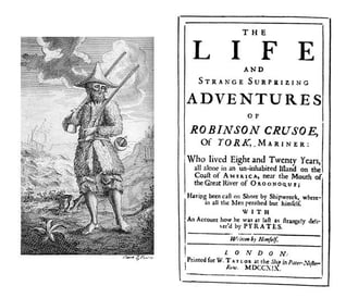
Assignment two provides a creative opportunity to put into practice what you have learnt so far, by exploring the physicality of the book in relation to its function and working through the design process in relation to a set brief. Your brief Design the book format and cover artwork for two different versions of Daniel Defoe’s classic 1719 novel Robinson Crusoe. The publishers, Viking Press, have decided to re-release this title as a new pocket edition for readers on the move that reflects the adventurous nature of the story within a contemporary setting. This paperback version should have a modern visual feel that can compete with new titles in the bookshop. They also want a deluxe edition for armchair readers and classic book collectors that references the historical nature of the story and its associations. Produce book design ideas and cover artwork to reflect the content of the story across both formats and contexts. Be creative and inventive with both the look and format of these books. As a side project to accompany the re-release of R obinson Crusoe, Viking Press has also asked you to design a new book called Washed ashore: The ultimate guide to surviving on a desert island by Rik Bennett. This is a ‘how to’ guide that should reflect not only the practical advice it offers, but something of the adventure of being a castaway. The scale, stock and binding of these publications are up to you. The pocket edition needs to celebrate the functionality of the book as a lightweight, transportable object, and to connect to the story’s travel or survival themes in a contemporary way. The deluxe edition can present the content in a larger, finer, more luxurious, considered or expanded way, that perhaps makes reference to the history of the book itself. Your designs need to be seen as part of a series across both versions, so think about how you adapt your designs to fit each format. The shipwreck guide needs to be seen as a separate genre, piggy-backing on the success of R obinson Crusoe. Develop visual ideas that can distinguish the survival guide from your R obinson Crusoe designs, while at the same time making some thematic connection between them. Your design should include the front, back, spine and flaps of your covers – if you opt for a traditional book binding. You can also come up with alternative ways of binding, and therefore designing your books if you want to. Generate your own illustrations, photography or artwork for the covers, source copyright free images, or treat the covers purely typographically. This is an opportunity to be creative with both your design thinking and outcomes, so experiment, and test out a range of visual and physical options. You may want to extend your project by also designing a number of sample pages from the inside of the book. When creating sample pages, try to make a link between the cover design and the design of the inside pages. Present your ideas by mocking up each of the books and their covers, and by presenting the overall spec of your designs (what paper stock you are using, etc.). Daniel Defoe, Robinson Crusoe, 1719. Title Page and Cover featuring engraving by John Clark and John Pine after design by unknown artist. Wikipedia.
“From this moment I began to conclude in my mind that it was possible for me to be more happy in this forsaken, solitary condition that it was possible I should ever have been in any other particular state in the world; and with this thought I was going to give thanks to God for bringing me to this place.” Daniel Defoe, R obinson Crusoe, 1719 Work through the design process, documenting it in your learning log as you go. Use rough drawings, notes, diagrams, mock-ups of your books, photographs of what you’re working on, and by saving different stages of any digital work to show your process. Talk about your creative process through notes and reflections.
Research and ideas
Read the brief, identifying keywords, and do the same for Defoe’s text. You don’t have to read the whole book, but make yourself broadly familiar with the story and identify key themes, motifs and images. The full text of the novel is available here: h ttp://www.gutenberg.org/ebooks/521 Identify the research you need to undertake. This could include researching existing versions of this cover, others of the same genre, or seeking inspiration elsewhere. The same goes for your survival guide. This brief requires some lateral thinking, so develop ideas that are unexpected, as well as the obvious. Generate thumbnail sketches to document and explore your creative thinking process. Aim to come up with a range of different ideas from which you can select and test different outcomes.
Present visual outcomes
Develop your initial ideas through making, drawing, collage, photography or whatever other mediums you choose. Be playful and let new ideas emerge through your making process. See this as a project, rather than a linear journey, so you may want to return to earlier stages of the process to develop new lines of visual enquiry or to take creative risks and try new things out. For the deluxe edition of the book, you may want to access the Bridgeman Library to source copyright free illustrations from previous editions of the book. Think about how your choice of scale, paper selection, and binding can help support your ideas in visual and tactile ways. If you are unable to source particular materials, then find other ways of visualising or describing your choices.
Lay out the jacket using DTP software and incorporating text and image(s). Design a range of versions of the jacket to choose from. Print the jacket designs and make a mock-up of the jacket onto either an existing book, or find other ways of mocking up the scale of the books. Photograph both versions of the book jackets as your final outcome to the project brief.
Reflection
Reflect on your outcomes but more so on your creative process – what worked for you, and how might you adapt these approaches for future projects? Just a reminder to think about how well you have done against the assessment criteria and make notes in your learning log.
Analysing the brief
What have I been asked to design? 1) Robinson Crusoe – Pocket edition 2) Robinson Crusoe – Collector’s Edition 3) How to survival guide
Who is the target audience? Adventure enthusiasts
How will it be produced? Paperback and hardcover
Keywords
3 books
Paperback
Hardcover
Classic
Adventurous
Part of the series
Modern
Contemporary
Including: title, author’s name, publisher’s name and trademark, price, barcode, endpapers
Primary Research
About Robinson Crusoe
Previous book covers
SecondaryResearch
Inspiration
Material
Dimensions
About Robinson Crusoe
The novel Robinson Crusoe tells the story of a young and impulsive Englishman that defies his parents’ wishes and takes to the seas seeking adventure. The young Robinson Crusoe is shipwrecked and castaway on a remote tropical island for 28 years. The story may be based on the true-life events of Alexander Selkirk, a Scottish castaway who survived four years on a Pacific island, or Henry Pitman, a political rebel surgeon castaway from a Caribbean penal colony. This classic tale of adventure features cannibals, captives, and mutineers. Some regard it as the very first modern novel written in the English language, launching the publishing industry.
Daniel Defoe published Robinson Crusoe on April 25, 1719. Its original title must not have fit on the cover: “The Life and Strange Surprizing Adventures of Robinson Crusoe, Of York, Mariner: Who lived Eight and Twenty Years, all alone in an un-inhabited Island on the Coast of America, near the Mouth of the Great River of Oroonoque; Having been cast on Shore by Shipwreck, wherein all the Men perished but himself. With An Account how he was at last as strangely deliver’d by Pyrates.”
Who is the real Robinson Crusoe?
With any truly great novel, the questions are usually the same. Where did the story come from? What inspired it? Were the characters or plot based on real-life elements? But these tried-and-true questions might mean a little more when asked about Daniel Defoe’s 1719 debut novel Robinson Crusoe, a book literary scholars the world over regard as one of the first realistic fiction novels and one that helped popularize the form we still crave today.
Presented as something of an autobiography of the book’s titular character, the novel details the 30 years Crusoe spent as a castaway on a remote tropical island near what is now Trinidad. Throughout the story, Crusoe encounters cannibals, other captives, and mutineers before finally being rescued right at the novel’s end.
It’s part faux-travelogue, part diary, and part adventure novel, and Defoe’s ability to create vivid, heart-pounding scenes of action, intrigue, and romance paved the way for centuries of aspiring-writers to tell their own stories of adventure and peril.
But where did Robinson Crusoecome from? How did Defoe—who held a number of interesting professions, including a trader, writer, and spy—harness the elements of the story and mold them into this classic English novel?
Theories abound on the origins of the novel and the source material Defoe had at his disposal. Even today, nearly 300 years after its initial publication, academics and scholars still quibble over the search for the real Robinson Crusoe and the story behind the story.
Previous book covers
Elements used in previous book covers:
People
Island
Palm tree
Sea
Wreck ship
Leaves
Fire
Stormy night
foot step
Gun
Parrot
Mostly coloured
Different typeface
Secondary Research
Standard Book Sizes Info
Here is a list of standard book sizes that are manufactured in the UK. If you produce your book at a standard size then you are ensuring that it is printed in the most cost effective and efficient way.
However we do not insist that you stick to these sizes and can produce custom sizes.
Please note that if you are measuring a hardback book on your bookshelf then you need to measure the inner book block and not the outside of the case to find out the size that we would need to give you an estimate on.
Book (trim) size – Height x width
A6: 148 x 105mm
A Format: 178 x 111mm
B Format (UK): 198 x 129mm
B Format (US): 203 x 127mm
A5: 210 x 148mm
Demy: 216 x 138mm
American Royal: 229 x 152mm
Royal: 234 x 156mm
Pinched Crown Quarto: up to 248 x 171mm
Crown Quarto: 246 x 189
A4: 297 x 210mm
For the pocket size book, I’m going to choose “B Format” and “A4” size for the hardback, collector’s edition. Size for the How-to-book would be “A6”, 105 x 148 mm.
Materials
Uncoated Types of Paper:
Wide range of use for almost all genres
80 gsm Opaque
This is our most common paper type. It is a plain white, smooth paper, similar to what you would print documents at home on. There is a slight show through but not noticeable unless you have heavy printing to one side.
Good for:
Non-fiction and poetry books
Keeping the price of your book low
Keeping the weight of your book low
100 gsm Opaque
This is the same type of paper as our 80gsm opaque paper but at 100gsm. This will give your book a more premium feel and will have less show through than the 80gsm paper.
Good for:
Non-fiction and poetry books
Giving your book a premium feel
Any books with illustrations, images or any colour artwork
80 gsm Bookwove White
Our bookwove papers are what you would find in most novels. They are not as smooth as the opaque paper types we have and help to ‘bulk’ your book up. The bookwove white paper is actually an off-white paper and will look cream when held next to a pure white opaque paper. Bookwove paper is also available in heavier weights but please contact us if you want to find out more.
Good for:
All fiction books
Black and white printing
‘Bulking’ up the thickness of your book
80 gsm Bookwove Cream
Our bookwove cream paper type is identical to our bookwove white paper apart from the colour. The bookwove cream paper is still suitable for all types of books but it is most commonly used for novels. Any colour printing on the cream paper will not reproduce very well.
Good for:
All fiction books especially novels
‘Bulking’ up the thickness of your book
Giving your book a traditional feel
100 gsm Recycled
This paper type is similar to our 100gsm opaque paper but it is not quite as smooth and being recycled paper it is not as white. The recycled paper type is great for making your book feel more premium like the opaque paper type but also with the added impact of being fully recycled.
Good for:
All fiction and non-fiction
Giving your book a premium feel
Eco-conscious
Coated Types of Paper:
Mainly used for books with lots of illustrations or photographs
115gsm Coated – matt / gloss
This is our lightest gsm coated paper which is fantastic for books that have any type of illustrations or photographs. We use this paper type for our mono and colour inserts as plate sections within your book. Because this paper type is a low gsm, it works well if you want a coated paper and your book has a lot of pages, 100+.
Good for:
All non-fiction genres
Keeping the weight of the book low
A premium book at a lower cost
130gsm Coated – matt / gloss
As the paper types get heavier the page count of the books is usually less to keep the weight of the book down. This particular gsm of paper is a good middle ground between a non-fiction book with a lot of pages and a regular photo book. If your book is over 100 pages and you want a coated paper, it may be best to opt for the 115 gsm as your finished book can start getting heavy.
Good for:
Most non-fiction genres
Any book with colour or mono illustrations or photographs
Children’s books
150gsm Coated – matt / gloss
This gsm of paper is a great paper type for photo books or books with a high amount of colour and mono images with under 100 pages. This is a premium paper that will give your book a fantastic feel.
Good for:
Non-fiction books with lots of illustrations or photographs
Photobooks
A Premium book
170gsm Coated – matt / gloss
This is our most premium paper type for the internals of your book. It is a fantastic paper reserved for those special photo books or any book that you want to last. As the paper is a high gsm it is a lot tougher than the previous paper types.
Good for:
Photobooks
Any premium book
Children’s books that need a strong paper
Mind mapping
Thumbnails
Design process
Design 1: Paperback
For the pocket book, I’ve chosen, sun, palm tree and a silhouette of a man. The main colour, I chose first was orange then changed it to green from palm tree leaves. I wanted to have the same colour pallet throughout three designs.
I made the illustration in Procreate and moved it to Photoshop for making final book cover design.
The cover of the paperback novel would be 240gsm with a gloss lamination to give the book some protection. For the paper 80gsm Bond paper seems a good choice to keep the cost down.
ProcreatePhotoshop
Design 2: Hard cover
Again for the second design, I started with Procreate. Then moved it to Photoshop for the final design.
I chose Papyrus condensed for the title as it got a rustic feel. However I changed it Georgia Regular as it was looking more sophisticated to be used in the series.
The original typeface was Savoye LEG for the author’s name and changed to Futura for the consistency throughout the designs.
The typeface that used for the blurb is Roboto Regular.
400gsm board for main book covers, with 120-150gsm uncoated pages. Spine sealed with a material such as a textured paper to create the green spine.
ProcreatePhotoshop
Design 3: How-To-Guide
300gsm cover, uncoated for more durability in ‘survival mode’. 120gsm inner pages, uncoated — paper made from a blend of grass or other plant materials to give the more natural feel. The island icon to be beveled to give a raised touch. Perfect bound due to size and scale.
Procreate Photoshop
Mockups
Self – reflection
It was a very challenging assignment as the material needed to be considered as well as designing. It was quite hard to come up with some new ideas as this book is very historical with lots of different book covers over the years.
I probably needed more sketches before choosing my final designs. However, I am happy with the final designs. I think I managed to portray my ideas in the best way that I could.
Overall, I enjoyed working on this assignment. As it helped me to understand about other elements, like materials apart from designing. Looking forward to working on next assignment.
“A rat in a maze is free to go anywhere, as long as it stays inside the maze.” Margaret Atwood, T he Handmaid’s Tale, 1985 Following on from the discussion of George Orwell’s novel 1984, look at the covers for Margaret Atwood’s equally dystopian novel The Handmaid’s Tale (1985), in which a woman finds herself surviving inside a harsh American fundamentalist society, that sees women’s roles as subservient cooks, matrons, and mothers. Alternatively, you can pick a different book to respond to, but it needs to be one with more than one cover design, so avoid recently published books. Are there key conceptual motifs being used over and over again within different cover treatments? Can you identify more expressive versions of the covers? Check the date of each version and try to speculate about the historical, political or social context for each one. (Don’t spend long on this but it’s important to realise that creative design doesn’t happen in a vacuum.) Using one of the main motifs you have identified (such as the uniforms that feature the book), the title of the book, author’s name, and no more than three colours (including black and white), generate as many different layouts of the cover design as you can. Think about how you can dynamically layer, organise, frame, clash, or balance these elements. Work quickly and come up with lots of different visual possibilities. This is a similar exercise to the Lightbulb Project in Graphic Design 1, which aims to generate quick design possibilities by arranging your typography, motif and colours in as many, and as varied, ways as possible.
The Handmaid’s Tale
The true first edition, 1985 (Canada). Tad Aronowicz, design; Gail Geltner, collage.
The novel explores themes of subjugated women in a patriarchal society, loss of female agency and individuality, suppression of women’s reproductive rights, and the various means by which women resist and attempt to gain individuality and independence.
Design: 1998
This traditional cover design showing some scenes from the book in front of the wall. Not giving enough information about the content. Full colour design gives it an expensive look and feel.
Bloomsbury edition, 2009.
This design has got some decorative illustration. It’s a conceptual design and doesn’t give enough information about the concept of the book.
Vintage Classics, 2010.
This cover designed by an Australian designer. The 2 colours makes it like it has been overprinted. The design is minimal and the figures are all the same and showing lack of identity of women in this book.
Vintage Classics, 2016.
This illustrative cover for the Penguin Classic range, there are some flowers, which I guess representing the beauty of the handmade. The designer kept the figure and the original colours. “The Wall” can be seen at the background.
Design: 2017
This design is based on the TV series. The colour are red, white and black followed by a photograph of the actress.
Design: 2019
This design is slightly different from the other designs as the typography is the main focus and not the illustration.
Design: 2019
I think the interesting thing about this cover is although it was designed in 2019, it’s got more the older style feeling.
2019
This design is quite touching because of its simplicity and the use of red colour opposites to the black colour. To me I’d the most memorable cover design for this book.
Motifs
Colours: black, red, white
A figure of a woman
Faceless
The wall
For my designs, I have chosen black, white and red as a background. Instead of using a woman with a hood, I drawn a silhouette of a woman in my Procreate as my main element.
For the typography, I’ve chosen a serif typeface for the title matched with a sans serif typeface for the author’s name. I kept those typefaces throughout my designs to be able to concentrate on the composition and layout.
I used Procreate for making my different layouts of my cover design. I liked couple of them more, however I think they all have something for different audiences.
Self – reflection
It was interesting that by keeping one element, same colour palette and typeface how many different designs with different layouts can be made. I really enjoyed this exercise as it was a way to experiment with different compositions and layouts. I probably could make more of them by changing the typefaces and swapping the colours around.