This two part exercise aims to understand the relationship between typography, the grid, and the page in more depth by analysing existing layouts and creatively developing alternative ones. Both of these activities will feed into assignment three. Understanding layouts Research into book layouts that you find interesting. These could be art or design books, or others that have more complex layouts that balance images, typography and other content across multiple columns. Trace the grid structure of your chosen double-page spread using tracing paper and a sharp pencil. Measure the margins, column width and depth, plus spaces between the columns. Transcribe the tracing onto a clean sheet of paper, drawing on the measurements. Compare your drawings to other double-page spreads within the same publication. Identify the similarities and differences – is there an underlying grid system and how does it adapt to deal with different content? Now recreate the same double-page spread using DTP software. Use your traced drawing measurements as a guide. There is no need to copy out all the text – you can use ‘dummy’ text or ‘blurb’ such as l orem ipsum. Lorem ipsum is Latin text which has a distribution of letters that make it look like readable English. You can download some from http://www.lipsum.com and incorporate it into your layout. Similarly, there is no need to recreate the images – indicate images by a 10% shaded area, whether these are cut-out, full-bleed or within a box. Try to match the typeface as closely as possible. It doesn’t need to be exactly the same, but try to retain something of the original – for example, make sure you use a sans-serif font if the original is sans-serif.
Experimental layouts
“These conditioned patterns of reading, from left to right or top to bottom for example, allow us to approach any form of printed material with some expectation of how we will navigate through it. This, then, is the starting point for the designer, who is able to build upon this familiarity within the layout and format of a project, often utilising the element of surprise or difference to confound the reader or user’s expectations.” Russ Bestley & Ian Noble, E xperimental Layout, 2001. Hove: Rotovision.
Extend the project by thinking about how you might radically change these layouts – what creative decisions around the grid would you make to improve these designs? Develop layout ideas that ignore the grid structure, challenge it, or offer radical alternatives to the existing layouts. Develop a range of ideas through thumbnail drawings and DTP layouts, in a similar way to the first part of the exercise. Use this as an opportunity to take creative risks, and find radically different ways to layout the existing content. This process might challenge any preconceived rules about how a layout should normally work. Reflect on the process in your learning log.
Analysing existing layouts
For this part of the exercise, I chose ‘Folk Art Style’ by Sybil Edwards.
The reason that I chose this book is because of the amount of images in the book, it doesn’t follow any particular rules.
Measuring in millimeters
Based on one of the pages, I set up a spread in Indesign.
Different types of grids
There are many ways to set up a page layout and really depends on a function of the design.
Experimental
I made some thumbnails in Procreate. I’ve chosen one and made a layout based on that in Indesign.
Self – Reflection
This was an interesting exercise as I realized that there are many different grid layouts specially if I want to break the rules. Besides, there are more elements need to be considered in design like, Typography, hierarchy, composition.
What I need to work on is to collect more example of different layouts and research about their functions. There are some grid layouts that might not work for a specific function.
“Though largely forgotten today, methods and rules upon which it is impossible to improve have been developed over centuries. To produce perfect books these rules have to be brought back to life and applied.” Jan Tschichold, T he New Typography, 1 928 The Golden Section, or Golden Mean, has been applied by artists and designers over the centuries to create harmonious formats for their work. In his extensive research, Tschichold discovered that many book designs were based on the Golden Section. Based on a mathematical formula, and directly linked to the Fibonacci series, the Golden Section provides a method of creating and dividing space that is a useful working framework for the book designer. “To form a golden section rectangle from a square, the square is divided in half. The diagonal of the half square is rotated to the horizontal, defining the length of the rectangle.” AndrewHaslam, BookDesign, 2006
The red dotted lines show how a rectangle has been created from a square using the Golden Section principle. It is then divided to form 2 facing pages.
The Van de Graaf canon
The Van de Graaf canon is a historical reconstruction of a method that may have been used in book design to divide a page in pleasing proportions.[5] This canon is also known as the “secret canon” used in many medieval manuscripts and incunabula.
The geometrical solution of the construction of Van de Graaf’s canon, which works for any page width:height ratio, enables the book designer to position the type area in a specific area of the page. Using the canon, the proportions are maintained while creating pleasing and functional margins of size 1/9 and 2/9 of the page size. The resulting inner margin is one-half of the outer margin, and of proportions 2:3:4:6 (inner:top:outer:bottom) when the page proportion is 2:3 (more generally 1:R:2:2R for page proportion 1:R). This method was discovered by Van de Graaf, and used by Tschichold and other contemporary designers; they speculate that it may be older. The page proportions vary, but most commonly used is the 2:3 proportion. Tschichold writes “For purposes of better comparison I have based his figure on a page proportion of 2:3, which Van de Graaf does not use.” In this canon the type area and page size are of same proportions, and the height of the type area equals the page width. This canon was popularized by Jan Tschichold in his book The Form of the Book.
Van de Graaf devised this construction to show how Gutenberg and others may have divided their page to achieve margins of one-ninth and two-ninths and a type area in the same proportions as the page.
Robert Bringhurst, in his The Elements of Typographic Style, asserts that the proportions that are useful for the shapes of pages are equally useful in shaping and positioning the textblock. This was often the case in medieval books, although later on in the Renaissance, typographers preferred to apply a more polyphonic page in which the proportions of page and textblock would differ.
Golden canon
Tschichold’s “golden canon of page construction” here illustrated by a synthesis of Tschichold’s figure thereof, with the diagonals and circle, combined with Rosarivo’s construction by division of the page into ninths. These two constructions rely on the 2:3 page ratio to give a type area height equal to page width as demonstrated by the circle, and result in margin proportions 2:3:4:6 (inner:top:outer:bottom). For other page ratios, Rosarivo’s method of ninths is equivalent to van de Graaf’s canon, as Tschichold observed.
Medieval manuscript framework according to Tschichold, in which a type area proportioned near the golden ratio is constructed. “Page proportion is 2:3, type area proportioned in the Golden Section.”
Interpretation of Rosarivo
Tschichold’s “golden canon of page construction” is based on simple integer ratios, equivalent to Rosarivo’s “typographical divine proportion”.
Raúl Rosarivo analyzed Renaissance-era books with the help of a drafting compassand a ruler, and concluded in his Divina proporción tipográfica (“Typographical Divine Proportion”, first published in 1947) that Gutenberg, Peter Schöffer, Nicolaus Jenson and others had applied the golden canon of page construction in their works. According to Rosarivo, his work and assertion that Gutenberg used the “golden number” 2:3, or “secret number” as he called it, to establish the harmonic relationships between the diverse parts of a work, was analyzed by experts at the Gutenberg Museum and re-published in the Gutenberg-Jahrbuch, its official magazine. Ros Vicente points out that Rosarivo “demonstrates that Gutenberg had a module different from the well-known one of Luca Pacioli” (the golden ratio).
Tschichold also interprets Rosarivo’s golden number as 2:3, saying:
The figures he refers to are reproduced in combination here.
Tschichold’s “golden canon of page construction” here illustrated by a synthesis of Tschichold’s figure thereof, with the diagonals and circle, combined with Rosarivo’s construction by division of the page into ninths. These two constructions rely on the 2:3 page ratio to give a type area height equal to page width as demonstrated by the circle, and result in margin proportions 2:3:4:6 (inner:top:outer:bottom). For other page ratios, Rosarivo’s method of ninths is equivalent to van de Graaf’s canon, as Tschichold observed.
Medieval manuscript framework according to Tschichold, in which a type area proportioned near the golden ratio is constructed. “Page proportion is 2:3, type area proportioned in the Golden Section.”
John Man’s interpretation of Gutenberg
Historian John Man suggests that both the Gutenberg Bible’s pages and printed area were based on the golden ratio (commonly approximated as the decimal 0.618 or the ratio 5:8).[16] He quotes the dimensions of Gutenberg’s half-folio Bible page as 30.7 x 44.5 cm, a ratio of 0.690, close to Rosarivo’s golden 2:3 (0.667) but not to the golden ratio (0.618).
Tschichold and the golden ratio
Building on Rosarivo’s work, contemporary experts in book design such as Jan Tschichold and Richard Hendel assert as well that the page proportion of the golden ratio has been used in book design, in manuscripts, and incunabula, mostly in those produced between 1550 and 1770. Hendel writes that since Gutenberg’s time, books have been most often printed in an upright position, that conform loosely, if not precisely, to the golden ratio.
These page proportions based on the golden ratio, are usually described through its convergents such as 2:3, 3:5, 5:8, 8:13, 13:21, 21:34, etc.
Tschichold’s drawing of an octavo-format page proportioned in the golden ratio. The type area and margin proportions are determined by the starting page proportions.
Tschichold says that common ratios for page proportion used in book design include as 2:3, 1:√3, and the golden ratio. The image with circular arcs depicts the proportions in a medieval manuscript, that according to Tschichold feature a “Page proportion 2:3. Margin proportions 1:1:2:3. Type area in accord with the Golden Section. The lower outer corner of the type area is fixed by a diagonal as well.” By accord with the golden ratio, he does not mean exactly equal to, which would conflict with the stated proportions.
Tschichold refers to a construction equivalent to van de Graaf’s or Rosarivo’s with a 2:3 page ratio as “the Golden Canon of book page construction as it was used during late Gothic times by the finest of scribes.” For the canon with the arc construction, which yields a type area ratio closer to the golden ratio, he says “I abstracted from manuscripts that are older yet. While beautiful, it would hardly be useful today.”
Of the different page proportions that such a canon can be applied to, he says “Book pages come in many proportions, i.e., relationships between width and height. Everybody knows, at least from hearsay, the proportion of the Golden Section, exactly 1:1.618. A ratio of 5:8 is no more than an approximation of the Golden Section. It would be difficult to maintain the same opinion about a ratio of 2:3.”
Tschichold also expresses a preference for certain ratios over others: “The geometrically definable irrational page proportions like 1:1.618 (Golden Section), 1:√2, 1:√3, 1:√5, 1:1.538, and the simple rational proportions of 1:2, 2:3, 5:8 and 5:9 I call clear, intentional and definite. All others are unclear and accidental ratios. The difference between a clear and an unclear ratio, though frequently slight, is noticeable… Many books show none of the clear proportions, but accidental ones.”
John Man’s quoted Gutenberg page sizes are in a proportion not very close to the golden ratio, but Rosarivo’s or van de Graaf’s construction is applied by Tschichold to make a pleasing type area on pages of arbitrary proportions, even such accidental ones.
Tschichold’s drawing of an octavo-format page proportioned in the golden ratio. The type area and margin proportions are determined by the starting page proportions.
Reflection
Prior to this research task, my knowledge about the golden ratio was just in logo design. After some research, I’ve had learnt a lot about golden section and how to make a proportional grid from it. Hopefully, this knowledge can help me with my next part of the course.
Find as many examples of type as you can from a range of sources, including newspapers, magazines, flyers, leaflets, online, and printed ephemera. Broadly classify them into serif and sans-serif groups. Explore your computer to see whether you have any of the typefaces mentioned on the previous page. Find other examples on your computer that relate to these classifications. Print these off and begin to create a collection of type samples.
Identify Choose five different typefaces from your classification collection and now look for examples of how they can be used for reading in different contexts. For example, which typeface would be appropriate for a magazine, a science book or newspaper? Have you collected a typeface that might be suitable for all these subjects? As a way of testing out which typefaces might be appropriate for a particular job, also consider them as inappropriately as you can – find contexts in which they don’t work, look ugly or feel ‘wrong’ in some way. Do this by experimenting visually with your typeface choices.
Reflect Consider and reflect on the nature of the type you are collecting. Examine and annotate printouts with your own impressions of the letterforms. Use descriptive words that express something of the form and character of the typeface. Follow the same process for your ‘wrong’ typefaces as well.
Develop Trace some interesting, unusual and everyday letterforms onto clean paper. This will help you to understand the distribution of weight of line within a particular letterform. Draw over the tracing to enhance the line and fill in the letterform with an even dark grey tone – HB pencil is fine – to recreate the impression of print.
Document and present The work you produce for this exercise will feed directly into your assignment, so collate your notes, printouts, traced letterforms and samples of type you have gathered. Consider how these could be inventively and visually integrated, and how your ideas could be creatively developed further for your assignment.
Font collections – books
For the start, I’ve collected some books and took a photo of the fonts. I put all the covers in one page and all the body text in another page.
Based on my collection, I’ve noticed that for the non fiction text books a sans serif font has used for the title. For the fiction books, a serif font has been used for the title.
The body texts are mostly serif fonts as they are more legible.
Font collections – Wordmark
I’ve typed “Type Samples“ on Wordmark website and had a list of serif and sans serif fonts on my laptop. Then put them in two groups; Serif and Sans Serif.
Font collections – favourite
The image underneath is a screenshot of my favourite fonts on my laptop.
Then I chose; Garamond, Museo Slab, Raleway and Lust Slim.I used them in different sizes on Illustrator to be able to compare them together.
Analysing fonts
Tracing
For the next part, I’ve printed of some words using different fonts; serif, sans serif, script, then traced them.
Self – reflection
I’ve been always fascinated by typography. Wherever I look, one of the first thing that get my attention is the font and how they’re presented. After this exercise, I am even more aware of fonts around me. Specially, the tracing exercise was helping me to get closer to each typeface and their characteristics.
This exercise showed me how much type can influence the feel of a piece of work.
I believe to increase my knowledge, I need to collect more font samples.
I’ve got favourite fonts that I’ve used normally. Sometimes I need to come out of my comfort zone and have some bold choices in using my fonts in my work.
Part two looked at the structure of a book, and at how this may be adapted to reflect a book’s function. It examined the format, scale and size of books, considered the choices of paper and binding available to designers, and examined how this relates to the nature of the book as an object to be held, read and interacted with. Your practical work is of a very high standard, and you are conducting some good research. Further independent exploration of design is recommended.
My respond to the feedback
Very happy with the overall comments. To increase my knowledge and improve my work, I need to do more research prior my work.
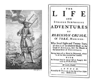
Assignment two provides a creative opportunity to put into practice what you have learnt so far, by exploring the physicality of the book in relation to its function and working through the design process in relation to a set brief. Your brief Design the book format and cover artwork for two different versions of Daniel Defoe’s classic 1719 novel Robinson Crusoe. The publishers, Viking Press, have decided to re-release this title as a new pocket edition for readers on the move that reflects the adventurous nature of the story within a contemporary setting. This paperback version should have a modern visual feel that can compete with new titles in the bookshop. They also want a deluxe edition for armchair readers and classic book collectors that references the historical nature of the story and its associations. Produce book design ideas and cover artwork to reflect the content of the story across both formats and contexts. Be creative and inventive with both the look and format of these books. As a side project to accompany the re-release of R obinson Crusoe, Viking Press has also asked you to design a new book called Washed ashore: The ultimate guide to surviving on a desert island by Rik Bennett. This is a ‘how to’ guide that should reflect not only the practical advice it offers, but something of the adventure of being a castaway. The scale, stock and binding of these publications are up to you. The pocket edition needs to celebrate the functionality of the book as a lightweight, transportable object, and to connect to the story’s travel or survival themes in a contemporary way. The deluxe edition can present the content in a larger, finer, more luxurious, considered or expanded way, that perhaps makes reference to the history of the book itself. Your designs need to be seen as part of a series across both versions, so think about how you adapt your designs to fit each format. The shipwreck guide needs to be seen as a separate genre, piggy-backing on the success of R obinson Crusoe. Develop visual ideas that can distinguish the survival guide from your R obinson Crusoe designs, while at the same time making some thematic connection between them. Your design should include the front, back, spine and flaps of your covers – if you opt for a traditional book binding. You can also come up with alternative ways of binding, and therefore designing your books if you want to. Generate your own illustrations, photography or artwork for the covers, source copyright free images, or treat the covers purely typographically. This is an opportunity to be creative with both your design thinking and outcomes, so experiment, and test out a range of visual and physical options. You may want to extend your project by also designing a number of sample pages from the inside of the book. When creating sample pages, try to make a link between the cover design and the design of the inside pages. Present your ideas by mocking up each of the books and their covers, and by presenting the overall spec of your designs (what paper stock you are using, etc.). Daniel Defoe, Robinson Crusoe, 1719. Title Page and Cover featuring engraving by John Clark and John Pine after design by unknown artist. Wikipedia.
“From this moment I began to conclude in my mind that it was possible for me to be more happy in this forsaken, solitary condition that it was possible I should ever have been in any other particular state in the world; and with this thought I was going to give thanks to God for bringing me to this place.” Daniel Defoe, R obinson Crusoe, 1719 Work through the design process, documenting it in your learning log as you go. Use rough drawings, notes, diagrams, mock-ups of your books, photographs of what you’re working on, and by saving different stages of any digital work to show your process. Talk about your creative process through notes and reflections.
Research and ideas
Read the brief, identifying keywords, and do the same for Defoe’s text. You don’t have to read the whole book, but make yourself broadly familiar with the story and identify key themes, motifs and images. The full text of the novel is available here: h ttp://www.gutenberg.org/ebooks/521 Identify the research you need to undertake. This could include researching existing versions of this cover, others of the same genre, or seeking inspiration elsewhere. The same goes for your survival guide. This brief requires some lateral thinking, so develop ideas that are unexpected, as well as the obvious. Generate thumbnail sketches to document and explore your creative thinking process. Aim to come up with a range of different ideas from which you can select and test different outcomes.
Present visual outcomes
Develop your initial ideas through making, drawing, collage, photography or whatever other mediums you choose. Be playful and let new ideas emerge through your making process. See this as a project, rather than a linear journey, so you may want to return to earlier stages of the process to develop new lines of visual enquiry or to take creative risks and try new things out. For the deluxe edition of the book, you may want to access the Bridgeman Library to source copyright free illustrations from previous editions of the book. Think about how your choice of scale, paper selection, and binding can help support your ideas in visual and tactile ways. If you are unable to source particular materials, then find other ways of visualising or describing your choices.
Lay out the jacket using DTP software and incorporating text and image(s). Design a range of versions of the jacket to choose from. Print the jacket designs and make a mock-up of the jacket onto either an existing book, or find other ways of mocking up the scale of the books. Photograph both versions of the book jackets as your final outcome to the project brief.
Reflection
Reflect on your outcomes but more so on your creative process – what worked for you, and how might you adapt these approaches for future projects? Just a reminder to think about how well you have done against the assessment criteria and make notes in your learning log.
Analysing the brief
What have I been asked to design? 1) Robinson Crusoe – Pocket edition 2) Robinson Crusoe – Collector’s Edition 3) How to survival guide
Who is the target audience? Adventure enthusiasts
How will it be produced? Paperback and hardcover
Keywords
3 books
Paperback
Hardcover
Classic
Adventurous
Part of the series
Modern
Contemporary
Including: title, author’s name, publisher’s name and trademark, price, barcode, endpapers
Primary Research
About Robinson Crusoe
Previous book covers
SecondaryResearch
Inspiration
Material
Dimensions
About Robinson Crusoe
The novel Robinson Crusoe tells the story of a young and impulsive Englishman that defies his parents’ wishes and takes to the seas seeking adventure. The young Robinson Crusoe is shipwrecked and castaway on a remote tropical island for 28 years. The story may be based on the true-life events of Alexander Selkirk, a Scottish castaway who survived four years on a Pacific island, or Henry Pitman, a political rebel surgeon castaway from a Caribbean penal colony. This classic tale of adventure features cannibals, captives, and mutineers. Some regard it as the very first modern novel written in the English language, launching the publishing industry.
Daniel Defoe published Robinson Crusoe on April 25, 1719. Its original title must not have fit on the cover: “The Life and Strange Surprizing Adventures of Robinson Crusoe, Of York, Mariner: Who lived Eight and Twenty Years, all alone in an un-inhabited Island on the Coast of America, near the Mouth of the Great River of Oroonoque; Having been cast on Shore by Shipwreck, wherein all the Men perished but himself. With An Account how he was at last as strangely deliver’d by Pyrates.”
Who is the real Robinson Crusoe?
With any truly great novel, the questions are usually the same. Where did the story come from? What inspired it? Were the characters or plot based on real-life elements? But these tried-and-true questions might mean a little more when asked about Daniel Defoe’s 1719 debut novel Robinson Crusoe, a book literary scholars the world over regard as one of the first realistic fiction novels and one that helped popularize the form we still crave today.
Presented as something of an autobiography of the book’s titular character, the novel details the 30 years Crusoe spent as a castaway on a remote tropical island near what is now Trinidad. Throughout the story, Crusoe encounters cannibals, other captives, and mutineers before finally being rescued right at the novel’s end.
It’s part faux-travelogue, part diary, and part adventure novel, and Defoe’s ability to create vivid, heart-pounding scenes of action, intrigue, and romance paved the way for centuries of aspiring-writers to tell their own stories of adventure and peril.
But where did Robinson Crusoecome from? How did Defoe—who held a number of interesting professions, including a trader, writer, and spy—harness the elements of the story and mold them into this classic English novel?
Theories abound on the origins of the novel and the source material Defoe had at his disposal. Even today, nearly 300 years after its initial publication, academics and scholars still quibble over the search for the real Robinson Crusoe and the story behind the story.
Previous book covers
Elements used in previous book covers:
People
Island
Palm tree
Sea
Wreck ship
Leaves
Fire
Stormy night
foot step
Gun
Parrot
Mostly coloured
Different typeface
Secondary Research
Standard Book Sizes Info
Here is a list of standard book sizes that are manufactured in the UK. If you produce your book at a standard size then you are ensuring that it is printed in the most cost effective and efficient way.
However we do not insist that you stick to these sizes and can produce custom sizes.
Please note that if you are measuring a hardback book on your bookshelf then you need to measure the inner book block and not the outside of the case to find out the size that we would need to give you an estimate on.
Book (trim) size – Height x width
A6: 148 x 105mm
A Format: 178 x 111mm
B Format (UK): 198 x 129mm
B Format (US): 203 x 127mm
A5: 210 x 148mm
Demy: 216 x 138mm
American Royal: 229 x 152mm
Royal: 234 x 156mm
Pinched Crown Quarto: up to 248 x 171mm
Crown Quarto: 246 x 189
A4: 297 x 210mm
For the pocket size book, I’m going to choose “B Format” and “A4” size for the hardback, collector’s edition. Size for the How-to-book would be “A6”, 105 x 148 mm.
Materials
Uncoated Types of Paper:
Wide range of use for almost all genres
80 gsm Opaque
This is our most common paper type. It is a plain white, smooth paper, similar to what you would print documents at home on. There is a slight show through but not noticeable unless you have heavy printing to one side.
Good for:
Non-fiction and poetry books
Keeping the price of your book low
Keeping the weight of your book low
100 gsm Opaque
This is the same type of paper as our 80gsm opaque paper but at 100gsm. This will give your book a more premium feel and will have less show through than the 80gsm paper.
Good for:
Non-fiction and poetry books
Giving your book a premium feel
Any books with illustrations, images or any colour artwork
80 gsm Bookwove White
Our bookwove papers are what you would find in most novels. They are not as smooth as the opaque paper types we have and help to ‘bulk’ your book up. The bookwove white paper is actually an off-white paper and will look cream when held next to a pure white opaque paper. Bookwove paper is also available in heavier weights but please contact us if you want to find out more.
Good for:
All fiction books
Black and white printing
‘Bulking’ up the thickness of your book
80 gsm Bookwove Cream
Our bookwove cream paper type is identical to our bookwove white paper apart from the colour. The bookwove cream paper is still suitable for all types of books but it is most commonly used for novels. Any colour printing on the cream paper will not reproduce very well.
Good for:
All fiction books especially novels
‘Bulking’ up the thickness of your book
Giving your book a traditional feel
100 gsm Recycled
This paper type is similar to our 100gsm opaque paper but it is not quite as smooth and being recycled paper it is not as white. The recycled paper type is great for making your book feel more premium like the opaque paper type but also with the added impact of being fully recycled.
Good for:
All fiction and non-fiction
Giving your book a premium feel
Eco-conscious
Coated Types of Paper:
Mainly used for books with lots of illustrations or photographs
115gsm Coated – matt / gloss
This is our lightest gsm coated paper which is fantastic for books that have any type of illustrations or photographs. We use this paper type for our mono and colour inserts as plate sections within your book. Because this paper type is a low gsm, it works well if you want a coated paper and your book has a lot of pages, 100+.
Good for:
All non-fiction genres
Keeping the weight of the book low
A premium book at a lower cost
130gsm Coated – matt / gloss
As the paper types get heavier the page count of the books is usually less to keep the weight of the book down. This particular gsm of paper is a good middle ground between a non-fiction book with a lot of pages and a regular photo book. If your book is over 100 pages and you want a coated paper, it may be best to opt for the 115 gsm as your finished book can start getting heavy.
Good for:
Most non-fiction genres
Any book with colour or mono illustrations or photographs
Children’s books
150gsm Coated – matt / gloss
This gsm of paper is a great paper type for photo books or books with a high amount of colour and mono images with under 100 pages. This is a premium paper that will give your book a fantastic feel.
Good for:
Non-fiction books with lots of illustrations or photographs
Photobooks
A Premium book
170gsm Coated – matt / gloss
This is our most premium paper type for the internals of your book. It is a fantastic paper reserved for those special photo books or any book that you want to last. As the paper is a high gsm it is a lot tougher than the previous paper types.
Good for:
Photobooks
Any premium book
Children’s books that need a strong paper
Mind mapping
Thumbnails
Design process
Design 1: Paperback
For the pocket book, I’ve chosen, sun, palm tree and a silhouette of a man. The main colour, I chose first was orange then changed it to green from palm tree leaves. I wanted to have the same colour pallet throughout three designs.
I made the illustration in Procreate and moved it to Photoshop for making final book cover design.
The cover of the paperback novel would be 240gsm with a gloss lamination to give the book some protection. For the paper 80gsm Bond paper seems a good choice to keep the cost down.
ProcreatePhotoshop
Design 2: Hard cover
Again for the second design, I started with Procreate. Then moved it to Photoshop for the final design.
I chose Papyrus condensed for the title as it got a rustic feel. However I changed it Georgia Regular as it was looking more sophisticated to be used in the series.
The original typeface was Savoye LEG for the author’s name and changed to Futura for the consistency throughout the designs.
The typeface that used for the blurb is Roboto Regular.
400gsm board for main book covers, with 120-150gsm uncoated pages. Spine sealed with a material such as a textured paper to create the green spine.
ProcreatePhotoshop
Design 3: How-To-Guide
300gsm cover, uncoated for more durability in ‘survival mode’. 120gsm inner pages, uncoated — paper made from a blend of grass or other plant materials to give the more natural feel. The island icon to be beveled to give a raised touch. Perfect bound due to size and scale.
Procreate Photoshop
Mockups
Self – reflection
It was a very challenging assignment as the material needed to be considered as well as designing. It was quite hard to come up with some new ideas as this book is very historical with lots of different book covers over the years.
I probably needed more sketches before choosing my final designs. However, I am happy with the final designs. I think I managed to portray my ideas in the best way that I could.
Overall, I enjoyed working on this assignment. As it helped me to understand about other elements, like materials apart from designing. Looking forward to working on next assignment.
“A rat in a maze is free to go anywhere, as long as it stays inside the maze.” Margaret Atwood, T he Handmaid’s Tale, 1985 Following on from the discussion of George Orwell’s novel 1984, look at the covers for Margaret Atwood’s equally dystopian novel The Handmaid’s Tale (1985), in which a woman finds herself surviving inside a harsh American fundamentalist society, that sees women’s roles as subservient cooks, matrons, and mothers. Alternatively, you can pick a different book to respond to, but it needs to be one with more than one cover design, so avoid recently published books. Are there key conceptual motifs being used over and over again within different cover treatments? Can you identify more expressive versions of the covers? Check the date of each version and try to speculate about the historical, political or social context for each one. (Don’t spend long on this but it’s important to realise that creative design doesn’t happen in a vacuum.) Using one of the main motifs you have identified (such as the uniforms that feature the book), the title of the book, author’s name, and no more than three colours (including black and white), generate as many different layouts of the cover design as you can. Think about how you can dynamically layer, organise, frame, clash, or balance these elements. Work quickly and come up with lots of different visual possibilities. This is a similar exercise to the Lightbulb Project in Graphic Design 1, which aims to generate quick design possibilities by arranging your typography, motif and colours in as many, and as varied, ways as possible.
The Handmaid’s Tale
The true first edition, 1985 (Canada). Tad Aronowicz, design; Gail Geltner, collage.
The novel explores themes of subjugated women in a patriarchal society, loss of female agency and individuality, suppression of women’s reproductive rights, and the various means by which women resist and attempt to gain individuality and independence.
Design: 1998
This traditional cover design showing some scenes from the book in front of the wall. Not giving enough information about the content. Full colour design gives it an expensive look and feel.
Bloomsbury edition, 2009.
This design has got some decorative illustration. It’s a conceptual design and doesn’t give enough information about the concept of the book.
Vintage Classics, 2010.
This cover designed by an Australian designer. The 2 colours makes it like it has been overprinted. The design is minimal and the figures are all the same and showing lack of identity of women in this book.
Vintage Classics, 2016.
This illustrative cover for the Penguin Classic range, there are some flowers, which I guess representing the beauty of the handmade. The designer kept the figure and the original colours. “The Wall” can be seen at the background.
Design: 2017
This design is based on the TV series. The colour are red, white and black followed by a photograph of the actress.
Design: 2019
This design is slightly different from the other designs as the typography is the main focus and not the illustration.
Design: 2019
I think the interesting thing about this cover is although it was designed in 2019, it’s got more the older style feeling.
2019
This design is quite touching because of its simplicity and the use of red colour opposites to the black colour. To me I’d the most memorable cover design for this book.
Motifs
Colours: black, red, white
A figure of a woman
Faceless
The wall
For my designs, I have chosen black, white and red as a background. Instead of using a woman with a hood, I drawn a silhouette of a woman in my Procreate as my main element.
For the typography, I’ve chosen a serif typeface for the title matched with a sans serif typeface for the author’s name. I kept those typefaces throughout my designs to be able to concentrate on the composition and layout.
I used Procreate for making my different layouts of my cover design. I liked couple of them more, however I think they all have something for different audiences.
Self – reflection
It was interesting that by keeping one element, same colour palette and typeface how many different designs with different layouts can be made. I really enjoyed this exercise as it was a way to experiment with different compositions and layouts. I probably could make more of them by changing the typefaces and swapping the colours around.
This exercise hopes to broaden your understanding of other book designers’ work by looking at their cover designs. Start to identify the kinds of book covers you are drawn to, and critically assess why you think these designs are successful.
Undertake a combination of library and internet research into the following designers, identifying a number of book cover designs for each. Reflect on their conceptual and/or expressive approaches to design. Write a very brief description of your selected cover designs and a brief overview of the designer – try to focus on keywords rather than long descriptions. Do this in note form, using the designer and the chosen example design to visually inform how the information appears in your learning log. ● Phil Baines ● Coralie Bickford-Smith ● Derek Birdsall ● Kelly Blair ● Irma Boom ● Suzanne Dean ● Julia Hastings ● Linda Huang ● Jost Huchuli ● Ellen Lupton ● Peter Mendelsund ● Paul Rand ● Paula Scher ● Jan Tschichold ● Wolfgang Weingart
Compare and contrast some of the cover designs. For example, how does the cover of Peter Mendelsund’s Kafka series compare with Coralie Bickford-Smith’s gothic horror series for Penguin? Are these expressive or conceptual in nature? Are they both conforming to genre expectations, or are they challenging them in some way? Do Jan Tschichold and Ellen Lupton’s cover designs have anything in common? Make a drawing, sketch or tracing of the covers you’re comparing to help give you a better understanding of the imagery, typography and arrangement within the design. Use your learning log to reflect on your comparisons, identifying which covers you think are the strongest and why.
Now, select three or more designers from the list that you are particularly drawn to, either because you like their work or because you don’t understand their approach, and research their design careers in more depth. Think about how they’ve responded to very different design challenges, whether they have an underlying conceptual and/or expressive approach, and how their work has evolved over time. Continue to use your learning log to record their work visually, explore these covers through drawing, and your responses in note format. See this as a quick fire activity rather than a long essay.
Finally, identify at least three different book designers you find visually engaging. To do this you might want to visit a library, bookshop, or browse online. Identify who designed these covers and find out more about them. Try to work out why you are drawn to them. Is it to do with genre or their approach to design? What is it about the design that captures you? What sort of imagery, if any, is used on the cover? How does the text relate to the image? What atmosphere or style does the cover evoke? Summarise your thinking in your learning log – focusing on the kinds of book covers you are drawn to and why – and continue to document what these covers look like.
Part 1
Phil Baines
Phil Baines was born in 1958 in Kendal, Cumbria, and studied for the Roman Catholic priesthood at Ushaw College, Durham. He abandoned his studies at the start of his fourth year, and in 1981 enrolled on a foundation course at Cumbria College of Art & Design. The following year he moved to London, to study graphic design at St Martin’s School of Art (1982-85), where he met contemporaries such as Andrew Altmann and David Ellis (later to form Why Not Associates) and his future wife, Jackie Warner.
Baines’s work of this period was heavily biased toward experimental typography that took inspiration from medieval manuscripts and the writings of Marshall McLuhan and George Steiner – he has often noted that his influences came from written rather than visual sources. Letterpress exerted a particular attraction due to its do-it-yourself aspect: the entire process could be handled from concept to production without outside involvement. After two further years of study at the Royal College of Art, Baines graduated during a pre-recession boom period for graphic design. His work was featured heavily in Typography Now: The Next Wave (edited by Rick Poynor and Edward Booth-Clibborn), and he contributed two typefaces to Fuse, and guest-edited its fourth issue.
Phil Baines has got a background in typography, which can be seen in these cover designs. The use of typography and minimal colour palette gave these covers a sophisticated and serious feel.
Coralie Bickford-Smith
Coralie Bickford-Smith is a London based designer, illustrator and author. She graduated from Reading University with a degree in Typography and Graphic communication then moved to London to pursue a career in publishing. Her first book, The Fox and the Star, was named Waterstones Book of the Year 2015 and as one of Time Out’s 100 Children’s Books of All Time.
Coralie’s design work has been recognised globally and featured in numerous publications, including The New York Times, Vogue and The Guardian. The work she did with Penguin Classics on the clothbound series attracted worldwide attention and harks back to the world of Victorian bindings and a golden age of book binding. Coralie has been commissioned to produce illustrations by a variety of clients including Fortnum and Mason, Diageo, Waterstones and Booths.
I really like these book covers by Coralie Bickford-Smith. I am really interested in pattern design and in my point of view these designs are very chic and sophisticated.
Derek Birdsall
Birdsall was born in Wakefield, Yorkshire in 1934 and attended The King’s School, Pontefract, Wakefield College of Art and Central School of Arts and Crafts in London. “At Central, Birdsall came under the influence of Anthony Froshaug, who – alongside Herbert Spencer and Edward Wright – taught his students the difference between beautiful lettering and typography proper, with its pre-eminent concerns of clarity, directness and, above all, textual legibility.” Birdsall failed to earn a diploma, however, and began his career in design in the late 1950s and early 1960s.
These book cover designs have got clever ideas in embedding images in between the typography. They are very conceptual, it means that they have some hidden meanings. They’re not giving too much information and leave the rest to the readers to figure it out. These designs have serious feel.
Kelly Blair
Kelly Blair is the art director of Pantheon books, an associate art director at Knopf, freelance illustrator.
This designer has got lots of different styles for her designs. The images used in her designs make it conceptual and gives the readers a little information about the book. The different typographical hierarchy.
Irma Boom
There are few designers working today who can claim to have the legacy that Irma Boom has. Born in the Netherlands, and still based in Amsterdam today, Boom has practiced for over 30 years under the moniker Irma Boom Office, producing hundreds of books – over 300, in fact.
Boom’s books are not your average paperbacks, but they aren’t coffee table books either. They are objects of use, made for the many – likened by her to “social housing” – and they wholly embody whatever concept or topic they tackle.
Irma Booms cover designs are about the form of the books as well as the different printing methods. The books are conceptual and not giving a lot information about the content.
Suzanne Dean
Suzanne has been Creative Director at Vintage Books since 2000. She designs and art directs all of Vintage’s imprints which include Jonathan Cape, Chatto & Windus, Harvill Secker and Bodley Head. Suzanne established the design for the Vintage Classics list in 2007.
She has worked on a wide range of cover designs for authors such as Mark Haddon, Haruki Murakami, Ian McEwan, Julian Barnes, Yuval Noah Harari, Richard Flanagan, Margaret Atwood and Rachel Kushner. Her covers include The Curious Incident of the Dog in the Night-Time, The Sense of an Ending, Sapiens, Atonement and The Handmaid’s Tale.
Before working at Vintage, Suzanne graduated from Kingston University, where she studied Graphic Design. Her first job was in general design, focusing on food packaging and brochures. A year later she was approached to join Penguin Books as a Senior Designer, working for Hamish Hamilton. Three years later she joined Macmillan, to work on the Picador list.
The patterns and the textures using in these books caught my attention. The designs are not very complicated, but repeated the design make them interesting. This designer used different techniques depending on the audience. The designs are conceptual with no any information about the contents.
Julia Hastings
Julia Hasting (born 1970 in Bremen, Germany) lives and works in Zürich. She is the creative director of Phaidon Press. She studied graphic design at the Staatliche Hochschule für Gestaltung in Karlsruhe, Germany, and finalized with a diploma. From 1993 to 1998 she has been designing corporate identities, posters and books for cultural clients, then she moved to London to design books for Phaidon Press, working closely with Alan Fletcher. In 2000 she moved to New York in order to run the new design department as the Art Director for Phaidon Press Inc., and in 2007 she has taken over the design direction at Phaidon Press and moved to Zürich, Switzerland. She taught Publication design at the design faculty of the Cooper Union School of Art in New York from 2001 to 2003. She has given lectures about her work at the BRNO Biennale of Graphic Design, The AIGA New York, Pentagram New York, F.I.T., the University of Lima, Peru, Integrated Design Conference, Antwerp, and has been a jury member in numerous international design competitions. Since 2003 she has been contributing illustration work to The New York Times and The New York Times Magazine. She is a member of the AGI since 2000.
These book designs look very sophisticated. The textures and patterns used in these designs made them different from other ordinary book covers. The typography used in different designs are vary due to the type of the design. The designs are conceptual and not giving lots of information to the readers about the content.
Linda Huang
Linda Huang is a graphic designer based in New York. Her work has been recognized by The Type Directors Club, Print Magazine, The New York Times, 50 Books | 50 Covers, and It’s Nice That, among others. She is currently an associate art director at Alfred A. Knopf. Formerly, she was an associate art director at Vintage & Anchor Books.
The playful typography and simple colour palette are very eye catching in these designs. The use of texture gave the designs more depth. The designs are conceptual.
Jost Huchuli
Jost Hochuli is one of the finest Swiss typographers and graphic designers. From 1952 to 1954 he studied graphic design at the Kunstgewerbeschule (School of Arts and Crafts) of St. Gallen. The year later he did one-year apprenticeship as a compositor at the Zollikofer & Co. printshop, also in St. Gallen. In 1955 he moved to Zurich to attend the composition class at the local Kusntgewerbeschule (School of Arts and Crafts), from which he graduated in 1958. The same year he relocated in Paris to study at the École Estienne under Adrian Frutiger. His work has been widely exhibited in Germany, Poland, Switzerland, and the United Kingdom. In 1993 he curated and designed the “Book Design in Switzerland” exhibition that travelled across Canada, Europe, and the U.S.A.
These cover designs are typographical based and following the design rules; hierarchy, alignment and grids, which are the characteristics of the Swiss design.
Ellen Lupton
Ellen Lupton is a writer, curator, educator, and designer. Lupton is the Betty Cooke and William O. Steinmetz Design Chair at MICA (Maryland Institute College of Art) in Baltimore. She serves as a senior curator at Cooper Hewitt, Smithsonian Design Museum in New York City.
Ellen Lupton’s designs are expressive as they reveal some information about the content of the book. Most of her designs are simple and typographical base.
Peter Mendelsund
Peter Mendelsund is the author of five books: the novel The Delivery (Farrar, Straus & Giroux, Winter 2020; “Gorgeously written…profound.” —Michael Cunningham, author of The Hours) and the novel Same Same (Vintage/Anchor, Winter ’18; “Breezy and profound in equal measure.” —The New York Times) as well the non-fiction works What We See When We Read, (“Welcome and fascinating”—Tim Parks, The New York Review of Books), Cover (“Cover pushes us to reconsider what we think we know about the graphic representation of words and ideas.”—The New Republic) and The Look of the Book (Crown/TenSpeed, Fall ’19). Mendelsund has been described by the New York Times as “one of the top designers at work today,” and his design work has been described by The Wall Street Journal as “the most instantly recognizable and iconic.” He is the Creative Director of The Atlantic.
These designs are very creative in terms of using repeating patterns to give the designs a 3 dimensional feel. There are some quirkiness to his designs. The use of ordinary objects that normally take for granted in his designs make them even more interesting. The designs are mostly expressive as they give some hint about the contents.
Paul Rand
Born Peretz Rosenbaum in 1914 and deceased in 1996, Paul Rand is a graphic design legend. Throughout his 60-years long career, he changed America’s opinion on visual communication. With his editorial designs, advertisements, and visual identity works, Rand brought avant-garde European ideas to the United-States, mixing visual arts and commercial design. His colourful combinations, approach of typography and use of media translate his desire to “defamiliarize the ordinary“. His style consequently still have an impact on graphic design today.
The designer uses overprinting, geometrical patterns and textures in these designs. The colour palette is simple. These designs has got some mysterious feel and make the readers curious to find out more about the content of the books.
Paula Scher
Paula Scher is one of the most influential graphic designers in the world. Described as the “master conjurer of the instantly familiar,” Scher straddles the line between pop culture and fine art in her work. Iconic, smart, and accessible, her images have entered into the American vernacular.
Paula Scher’s book cover designs are based on typography, initial of her name and her poster designs. Her designs are used for her own publication. These designs are expressive and giving out some ideas about content of the books.
Jan Tschichold
Tschichold claimed that he was one of the most powerful influences on 20th century typography. There are few who would attempt to deny that statement. The son of a sign painter and trained in calligraphy, Tschichold began working with typography at a very early age. Raised in Germany, he worked closely with Paul Renner (who designed Futura) and fled to Switzerland during the rise of the Nazi party. His emphasis on new typography and sans-serif typefaces was deemed a threat to the cultural heritage of Germany, which traditionally used Blackletter Typography and the Nazis seized much of his work before he was able to flee the country.
These covers have got a minimal colour palette. The main colour is red. The angle compositions are giving the designs some energetic feel or movement. The Penguin covers were refined by Tschichold in 1950s. Most of the designs are conceptual and giving out minimal information about the contents.
Wolfgang Weingart
wolfgang weingart, who was born in 1941 in salemertal in southern germany, attended the merz akademie in stuttgart from 1958 to 1960, where he familiarised himself with typesetting and the process of making linocuts and woodcuts. after this he trained as a typesetter and discovered swiss typography. since the 1970s wolfgang weingart has exerted a decisive influence on the international development of typography. in the late 1960s he instilled creativity and a desire for experimentation into the ossified swiss typographical industry and reflected this renewal in his own work.
These designs are typographical base. Wolfgang Weingart was one of the pioneers in experimental typography. He tend to break the rules to use typography as a design element not just for information.
Part 2
Part 3
Julia Hastings
Julia Hasting (born 1970 in Bremen, Germany) lives and works in Zürich. She is the creative director of Phaidon Press. She studied graphic design at the Staatliche Hochschule für Gestaltung in Karlsruhe, Germany, and finalized with a diploma. From 1993 to 1998 she has been designing corporate identities, posters and books for cultural clients, then she moved to London to design books for Phaidon Press, working closely with Alan Fletcher. In 2000 she moved to New York in order to run the new design department as the Art Director for Phaidon Press Inc., and in 2007 she has taken over the design direction at Phaidon Press and moved to Zürich, Switzerland. She taught Publication design at the design faculty of the Cooper Union School of Art in New York from 2001 to 2003. She has given lectures about her work at the BRNO Biennale of Graphic Design, The AIGA New York, Pentagram New York, F.I.T., the University of Lima, Peru, Integrated Design Conference, Antwerp, and has been a jury member in numerous international design competitions. Since 2003 she has been contributing illustration work to The New York Times and The New York Times Magazine. She is a member of the AGI since 2000.
Selected Awards: 2015 – Silver Cube, Art Directors Club (Sottsass) 2015 – Bronze Cube, Art Directors Club (WA) 2015 – Wooden Pencil Award, D&AD (Bruce Nauman) 2015 – Wooden Pencil Award, D&AD (WA) 2014 – Art Monographs Winner, British Book Design and Production Awards (Bruce Nauman) 2014 – Brand / Series Winner, British Book Design and Production Awards (Phaidon Focus) 2008 – Silver Medal, Art Directors Club, New York (Unmonumental) 2006 – Merit Award, Art Directors Club, New York (Sample) 2006 – Design Distinction, I.D. Magazine Design Review (Vitamin D) 2006 – Hnorable Mention, I.D. Magazine Design Review (Sample) 2005 – Silver Medal, Art Directors Club, New York (Vitamin D) 2005 – Award for Outstanding Design, Graphis Magazine, New York (Area) 2004 – Golden Bee Award, Moscow (10X10) 2003 – Golden Bee Award, Moscow (Area) 2003 – Gold Medal, Art Directors Club, New York (Andy Warhol – Vol. 1) 2003 – Hnorable Mention, I.D. Magazine Design Review (Blink) 2002 – Award for Typography, Golden Bee, Moscow (Andy Warhol – Vol. 1) 2002 – First Prize, A–Z Competition, Print magazine (Fresh Cream) 2002 – PDN Photo book awards (Blink) 2002 – Certificate of Typographic Excellence, Type Directors Club, New York 2000 – Disctintive Merit, Art Directors Club, New York (Magnumº) 2000 – BRNO Biennale of Graphic Design (Andy Warhol – Vol. 1) 2000 – 25th Kodak Fotobuchpreis, Stuttgart (Magnumº) 2000 – Design Distinction, I.D. Magazine Design Review (Fresh Cream) 2000 – PDN Photo book awards 1999 – Certificate of Typographic Excellence, Type Directors Club, New York 1998 – BRNO Biennale of Graphic Design (Magnumº) 1994 – BRNO Biennale of Graphic Design (Übergriff) 1993-1999 High Design Quality, German Award for Communikations-Design of the Design-Center Nordrheinwestfalen, Germany (Übergriff) 1999 – Award ITP International Poster Triennale in Toyama, Japan 1993-1995 The 100 best posters, Berlin, Germany 1994 – Broncemedaille, The nicest books of the world, Bookfair Leipzig/Frankfurt, Germany 1993 – Henri de Toulouse-Lautrec Gold Medal, 7th Triennale, German Poster Museum, Essen
Peter Mendelsund
Peter Mendelsund is the author of five books: the novel The Delivery (Farrar, Straus & Giroux, Winter 2020; “Gorgeously written…profound.” —Michael Cunningham, author of The Hours) and the novel Same Same (Vintage/Anchor, Winter ’18; “Breezy and profound in equal measure.” —The New York Times) as well the non-fiction works What We See When We Read, (“Welcome and fascinating”—Tim Parks, The New York Review of Books), Cover (“Cover pushes us to reconsider what we think we know about the graphic representation of words and ideas.”—The New Republic) and The Look of the Book (Crown/TenSpeed, Fall ’19). Mendelsund has been described by the New York Times as “one of the top designers at work today,” and his design work has been described by The Wall Street Journal as “the most instantly recognizable and iconic.” He is the Creative Director of The Atlantic.
Suzanne Dean
Suzanne has been Creative Director at Vintage Books since 2000. She designs and art directs all of Vintage’s imprints which include Jonathan Cape, Chatto & Windus, Harvill Secker and Bodley Head. Suzanne established the design for the Vintage Classics list in 2007.
She has worked on a wide range of cover designs for authors such as Mark Haddon, Haruki Murakami, Ian McEwan, Julian Barnes, Yuval Noah Harari, Richard Flanagan, Margaret Atwood and Rachel Kushner. Her covers include The Curious Incident of the Dog in the Night-Time, The Sense of an Ending, Sapiens, Atonement and The Handmaid’s Tale.
Before working at Vintage, Suzanne graduated from Kingston University, where she studied Graphic Design. Her first job was in general design, focusing on food packaging and brochures. A year later she was approached to join Penguin Books as a Senior Designer, working for Hamish Hamilton. Three years later she joined Macmillan, to work on the Picador list.
Part 4
Identify at least three different book designers you find visually engaging.
Noma Bar (born in 1973) is an Israel-born graphic designer, illustrator and artist. His work has appeared in many media publications including: Time Out London, BBC, Random House, The Observer, The Economist and Wallpaper*. Bar has illustrated over one hundred magazine covers, published over 550 illustrations and released three books of his work: Guess Who – The Many Faces of Noma Bar, Negative Space and Bittersweet a 680 page 5 volume monograph produced in a Limited Edition of 1000 published by Thames & Hudson
Bar’s work has become well known throughout the world, winning many industry awards; more recently a prestigious Gold Clio for his animation & direction work for the NewYork Presbyterian Hospital, a campaign to highlight new frontiers in cancer treatments.
He has also won a Yellow Pencil award at the D&AD Professional Awards and his London Design Festival exhibition ‘Cut It Out’, was selected as one of the highlights of the festival. The project was nominated in the graphics category for the Design Museum, Designs Of the Year.
Chip Kidd is a contemporary American graphic designer, author and editor. He is best recognized as graphic designer for book covers. Being a huge admirer of comic books he not only wrote some of those for DC Comics but also designed their covers. Born on 12 September 1964, in Pennsylvania, Chip Kidd grew up to be an associate art director at the New York publishing house, Knopf. He was hired at the publishing house as a junior assistant in 1986. Besides, Kidd freelanced for various firms and produced more than 70 book jackets per year. Some of the publishing houses he freelanced for included Farrar Straus & Giroux, Amazon, HarperCollins, Scribner and Penguin/Putnam. At Pantheon Book he designed the graphic novels.
Na Kim is a graphic designer based in Seoul and Berlin. After studying product design and graphic design in Korea, Kim participated in Werkplaats Typografie in the Netherlands. Kim is currently running the project space, LOOM in Berlin. Na Kim’s design practice as a system engages without putting limits on the field of graphic design. Kim is taking a methodology to collect objects and events found in everyday life and rearrange them into new order and rules, and ultimately expand design literacy. Besides many other projects, she was responsible for the concept and design of GRAPHIC magazine from 2009 till 2011 and has initiated series of projects based on her monograph, SET since 2015. She has held solo exhibitions, such as Bottomless Bag (2020), Black and White (2019), Red, Yellow, Blue (2017), SET (2015), Choice Specimen (2014), Found Abstracts (2011), Fragile (2006). Besides, Kim has been a curator for Brno Biennale, Chaumont Festival, Seoul International Typography Biennale, and Fikra Graphic Design Biennial. Kim also worked on projects with COS, Hermès, ÅLAND, and many other clients, and Kim’s works been invited to international exhibitions at MMCA, SeMA, V&A, MoMA, Milan Triennale Museum, Die Neue Sammlung, etc. Na Kim has been a member of AGI since 2016.
Further inform your understanding of paper and bookbinding by reading pages 165–180 of Alan Pipes’ chapter ‘O n Press’ available as a downloadable resource at http://www.oca-student.com/ Collect lots of different paper samples, and assemble these into a standalone book, or integrate them into your sketchbook. See this as the start of an ongoing resource that you can add to, and refer back to. Add notes to your paper sample book/sketchbook identifying the paper source, stock, and any reflection on the paper’s qualities. You may want to extend this investigation by exploring how your paper samples can be folded, combined, stitched, printed on, or bound together. Explore your samples’ physical properties by working with them, testing them out, and visually documenting the results of your research.
After reading pages 165–180 of Alan Pipes’ chapter ‘O n Press’, I’ve decided to order some sample books. So far one of the sample books from ‘solopress’ has arrived.
I really enjoyed looking at different paper weights Having images printed on them make them even more interesting. The information about the uses and the possible finishes are really helpful.
After looking at different types of papers and different kind of possible finishes, I am more interested in the papers used in different books and magazines. Hopefully after ordering and receiving more sample books, my knowledge in this field will help me in my future work.
The kind of stock you choose will be informed by the nature of the job you’re doing. If you were working commercially, then checking paper quality – the weight and finish of the paper – is something you would do with your client, as paper choices can add both quality and cost to a design job. The advent of high quality digital printing in almost every high street has made high finished standards much more achievable and affordable – although you might be amazed at what can be achieved with a photocopier and coloured 80gsm paper! Knowing what papers are available and their qualities is an important part of what you might offer as a commercial book designer. One way to do this is by requesting sample books from commercial paper merchants, or talking to your local printers, who can give you a swatch of the papers they recommend for you to share with your client and keep for future reference. Another way of doing this is by looking at as many different kinds of books as you can and critically start to gauge the weight, grain and finish of the papers. Do all books keep the same paper choices throughout? What’s the relationship between the covers and the paper inside? Which books do you like the feel of, and why? Analyse the binding style of the books you’ve collected. How does the book block adhere to the cover? How does it adhere to the spine? Is it stitched or glued? You’ll notice that in case-bound or hardback books, the sections, or signatures, are sewn together and glued to the spine. Paperback books, on the other hand, are more likely to be ’perfect-bound’, where the pages are glued together and then directly onto the covering.
Analysing
Little Women – Louisa May Alcott
The World of Dan and Phil – Dan Howell and Phil Lester
Familiarise yourself with the terminology used in describing the anatomy of a book and write some brief notes in your learning log on how the various structural elements could be modified to reflect the book’s function.
According to Andrew Haslam’s book the components of a book are:
Spine section of a book cover that covers the bound edge
Headband narrow band of thread tied to the sections that are often coloured to complement the cover binding.
Hinge fold in endpaper between pastedown and flyleaf
Head square small protective flange at the top of the book created by the cover and backboards being larger than the book leaves
Front pastedown endpaper pasted down to the inside of the front board.
Cover thick paper or board that attaches to and protects the book block.
Foredge square small protective flange at the foredge of the book created by the cover and back
Front board cover board at the front of the book
The tail square small protective flange at the bottom of the book created by the cover and backboards being larger than the book leaves.
Endpaper leaves of thick paper used to cover the inside of the cover board and support the hinge. The outer leaf is the pastedown or board paper; the turning page is the flyleaf.
Head top of the book
Leaves individual bound paper or vellum sheets of two sides or pages recto and verso.
Back pastedown endpaper pasted down to the inside of the backboard
Back cover board at the back of the book block.
Foredge front edge of the book.
Turn-in paper or cloth edge that is folded from the outside to the inside of the covers.
Tail bottom of the book
Flyleaf the turning-page of endpaper
Foot bottom of the page
Signature folded sheet of printed paper bound in sequence to form the printed block.
Book block the main block of pages created when book pages are sewn or glued together before binding.
Elements that can be changed to reflect the book’s function
Cover and spine
The cover of a book can majorly affect people’s perception of the book and also assists in selling the book and its contents. The quality or value of the book will impact on the type cover the book will have, whether it is a hard-cover or paperback. The type of printing can also vary depending on the type of book. Artwork may be printed directly on to the cover of a paperback book whereas hardbacks may be foil-blocked, embossed or have the artwork on a dust-jacket.
Orientation and size
Depending on the books function the orientation may change. The dimensions of the book also depend on its function, if it is meant to be read in hand or on a table.
Headband
The thread could be changed to match or complement the cover.
Leaves
The type and makeup of the pages will depend on the books function. The heavier paper would mainly be used for books that are coffee table books or presentation books that are meant to be thumbed through and are too large or heavy to be held in hand. Paperbacks and novel are usually printed on thinner paper to make them lighter so they can be easily held and transported. Children’s books are often made of thicker paper or board to give them extra strength to protect them from the destructive power of the child.
Binding
How this is bound can change depending on the type of book whether it is stapled, sewn together or glued.
Layout, grids, margins and gutters
These all depend on the type of book. The layout varies depending on the function and so does the grid to an extent. Grids can alter the style of the book directing and leading the reader in the right direction. The margins and gutters also depend on the function of the book. Novels have thicker margins allowing the reader to hold the book without inhibiting the view of the type, whereas coffee table and reference books don’t need such wide margins as they are meant to be left open on a table as opposed to it being held in hand.